Background
Note: I highly suggest you read this post in chunks, because it's really freaking long.
Tick, Tick...BOOM! is a show by Jonathan Larson (the same guy who created
Rent). It was originally a one-man show titled
30/90, and it is highly autobiographical. After Jonathan Larson's unexpected death in 1996,
30/90 was remade into a three-actor show, and performed off-Broadway in 2001.
Cast 'n' Crew, which is probably the most traditional of the three student theatre groups here at WashU, performed a production of it the weekend of October 8th, and I was the lighting designer (as well as the light board operator during the actual performance).
Just to emphasize how autobiographical this show is, the main character is named Jon, he is a musical composer living in New York City, wondering about his career choice, as his 30th birthday approaches without him ever having written a smash hit musical. Jon's most recent work is
Superbia (Larson himself wrote a musical by this title), and the play centers around Jon's life as he brings
Superbia to its first workshop, where he hopes to find a producer for it.
Jon's lifelong friend Michael has recently quit his acting career to become a "big-time market research exec", and Jon's girlfriend Susan is a dancer who teaches to "wealthy and untalented children". Both of them seem to be on the path to financial and emotional security, while Jon sees himself as still scrabbling around in the dirt, trying to find his true calling in life.
Technical Aspects
A lighting designer's job is heavily influenced by both equipment he is given to work with, and by the artistic aspects of the show. Designing for a show, as with all things in theatre, is partially a balancing act between what is desired and what is possible.
This particular show was held in the Village Theatre, which is a small space designed (poorly) for student theatrical use, located in the basement of the Village, which is a dorm-like building on the north side of campus. The Village Theatre is what is know as a "black box" theatre, which essentially means that it is simply a square room which has been outfitted with theatrical equipment so that shows can be performed there. I'll go over the types of theatres in a later post, but for now, just think of this theatre as a fairly normal room, with some additional bits and pieces added on (this is especially true for this particular space, since it really was originally designed as a normal room which they somehow thought was appropriate for theatrical productions. The theatre groups on campus complained, and while it's still a horrible theatre, but it's not quite as bad as it could have been).
Below, I am posting a copy of the lighting diagram for the Village Theatre. I'll let you take a look, and then explain in detail what all the different objects are. For reference, the diagram covers nothing but the usable stage area (the rest of the room is taken up by seating risers). It is about 37 feet wide and about 22 feet from the back curtain (wavy line) to the bottom of the image. The ceiling is about 12 feet tall. The audience would be located off the bottom edge of the image, looking "up" toward the back wall, which is at the top of the image.
So that I can more precisely indicate where things are located, I'm going to give you a quick primer in stage directions. They're not very complicated, but it's very helpful to know them, because they provide an absolute reference that everyone can agree upon, for any stage.
Stage directions are given from the perspective of an actor standing on the stage, facing the audience. The direction to this actor's right is called "stage right" and the direction to his left (all of my impersonal people are going to be male, because I think using "his or her" is choppy, and because if I switch back and forth, that implies a definite gender. Deal with it. :-P) is called "stage left". Toward the audience is called "down stage" and away from the audience is called "up stage".
As an aside, the standard explanation for the funny terminology of "up" and "down" stage is that in the days of Renaissance theatre, the stage was raked (tilted) so that everyone in the audience could see what was going on, rather than using raked seating, as we commonly do nowadays. Therefore, the back of the stage actually
was higher than the front of the stage, hence the terms "up" and "down".
I see one main problem with this explanation, however: the part of the stage that was raked was the part that the actors very rarely went onto. The actors mainly stayed on a flat portion of the stage which was set in front of the raked portion. The raked portion of the stage was actually used for giving scenery a forced perspective--putting people there would have looked weird, as they would have gotten bigger in relation to the buildings as they moved "up" stage. I can go into this at a later date as well, and probably will.
Anyway, now that you know where things are in a theatre, take a look at the diagram:

The first thing you probably noticed is that this doesn't really look like a ground plan of a building; there are no doors or furniture or wall thicknesses indicated. That's because this diagram's primary purpose is to indicate to the lighting designer where it is possible to hang lights. The most important feature of this diagram is showing the designer where the "grid" is located. The grid of a theatre is made up of a series of steel pipes (usually 1.5"-2" in diameter) hung from the ceiling that are specifically mounted to be able to carry the weight of lighting fixtures.
On this plot, as you've probably guessed by now, the grid is represented by a bunch of long, thin rectangles. The two large rectangles with hashes in them are heating ducts hanging from the ceiling. The smaller hashed rectangles are I-beam supports which run across the ceiling. Both of these things prevent you from hanging lights on top of or under them. You've also probably noticed that three of the grid pipes have slightly larger rectangles on top of them. Those rectangles represent the "electrics", which are essentially just big rows of electrical sockets into which lighting fixtures are plugged. In our theatre, the dimmers are also incorporated into the electrics. I'll cover dimmers some other time, but basically, they're the pieces of hardware which control how much power is getting to each fixture.
There are a few things which are not included on this diagram but which probably should be. Up stage center there is a projector screen hung from the ceiling. It is quite large, and there's a big long box to support the motor which lowers and raises the screen, which all can interfere with lights. There are also two large speakers hanging from the ceiling just downstage of the screen, and those also get in the way quite a bit.
Lastly, in the upstage right and left corners, there are additional electrical outlets. Electrical outlets which are not on the ceiling are usually referred to as "pockets", which probably comes from "floor pockets". Floor pockets are small trap doors in the floor that open up to allow access to electrical sockets mounted in the floor. They're a little bit like pockets on a pair of pants, hence the name. There are also "side pockets", which are located in the side walls of a theatre. Side pockets usually have vertically-mounted pipes in them so that you can hang lights right there.
In total, the Village Theatre has 24 dimmers, also called circuits. This basically means that I can have a maximum of 24 lighting instruments in the theatre that I can operate from the lighting board. This is not strictly true, as I will show you once I get to my actual plot, but it's a good rule of thumb. I actually ended up using 27 total lights. Cast 'n' Crew owns 28 or 29 fixtures all told, so I was pushing the limits of what is possible in that space. 27 lights isn't very many, but remember, this is a very small theatre. That many lights is adequate, although just barely.
Design Considerations
Now that we've got the technical stuff out of the way, it's time to move on to artsy-fartsy things. The first thing I do when I'm designing for any play is read the script. Then I usually read it again a few days later. I don't make any notes, I don't start analyzing metaphors, I just read the script. The reason for this is that my entire philosophy of theatre is that a play is designed to have a certain effect on you, and it's far more effective to let it have its intended effect and then learn to vocalize what that effect is, rather than to come at the play intellectually and try to get inside the playwright's head and learn what his intentions were that way.
For
Tick, Tick...BOOM!, I came away from the script with a feeling of isolation. Jon is the narrator of his own life, so he frequently has "asides"--moments where he pops "out" of the current scene and talks directly to the audience without any of the other characters being able to know what he's saying. I also had a feeling of night time--the entire play seemed dark and brooding to me, and a lot of the action seemed to happen during the night time. My third impression was of a city--this was a no-brainer, since it was in New York. It was gritty and kind of industrial.
My next step is normally to chat with the director about what I'm thinking. With this production, that didn't happen as much, because Dan is an inexperienced director (this was his first major show), and it's a student group, so we're not quite as organized as the PAD might be. In this instance, I ended up talking to him about my overall concepts for the show, (which is basically the previous paragraph) and he gave me the go-ahead.
If this had been a PAD show, my internal vision of the show would probably have been modified during my chats with the director. He might have said "Yeah, I see where you're going with the grittiness, but I think that the overall feeling is a little cleaner than that" (this did indeed happen, eventually--as we started writing lighting cues, I found that my vision of the show did differ slightly from Dan's, and we had to reconcile that as we worked). More experienced directors are better at what I mentioned above: vocalizing their own internal impressions of the play.
Once I get the show "in my head", so to speak, I'm kind of on hold until I get the set design. I can be thinking about colors and "looks", but I can't really sit down and create a lighting plot until I know what the set will look like and where the actors will be. Obviously, if I light a certain area, and the actors are always somewhere else, that is bad, so I have to see what the set looks like first. It's also good for me to come to rehearsals so that I can get an idea of the blocking, but I didn't really have enough time for that. This earned me a couple nasty surprises in the end, since there were two scenes in the show where people stood on top of things, which meant that they essentially disappeared, because their heads were over the light.
One of the mistakes that rookie light designers constantly make is that they light the floor, rather than the actors. The key thing to remember is that light from a fixture is actually a three-dimensional object. It spreads out in a cone, which means that the circle of light on the floor is usually not at all representative of where an actor will be lit. Most lights come from downstage and above eye level, so if you're standing at the far upstage edge of the circle of light on the floor, your feet will be lit, but nothing else. Likewise, you can be standing outside of the circle downstage, and still have your head lit perfectly well. It's actually acceptable to have someone's feet disappear, even up to the knees or a bit higher, so long as their head is still lit. Next time you're at a show that involves a spotlight (especially one in which there is dancing or jumping), watch how much of the actors are lit by the spotlight--you'll most likely see the actor get cut off below the knees multiple times.
To combat this lighting the floor problem, we have people stand where we want there to be light, and then we focus the light on their faces. That way, we can be assured that if someone is standing in that spot, his face will be lit. I didn't always have people around to help me focus lights (obviously, most people have better things to do than stand in one spot and be blinded for an hour and a half, if they're not getting paid), and that meant that I had to adjust the focus of the lights well into tech week, once I was able to see actual people under my lights.
Getting back to the scenes where people stood on top of blocks, I eventually had to hang a special fixture just to illuminate them. I filed that experience away in my head under the category of "things that I will tell the stage manager or director to notify me of a long time in advance"; it was a learning experience.
The Band
Anyway, once I got a copy of the set, I started designing. For this show, I actually started with designing lights for the band, because for some reason, they jumped out at me very quickly as to how I wanted them to look. The were to be set out in a row along the upstage wall of the theatre, behind a backdrop of a city skyline, and I wanted them to look like a hip jazzy sort of band, like the stage bands that they have on some of the late-night talk shows. I envisioned black suits and sunglasses, with intense blue and red light coming from opposite sides, and no light from the front or top.
This would make the instruments (especially the drums) sparkle and shine with different colors, and it would also keep the band's faces in quite a bit of shadow, so that they could stay impersonal and not intrude on the action. If any of you saw Tim Burton's
Corpse Bride, the jazz club scene in that with the dancing skeletons had almost exactly the light (and the color palette, for part of it) that I used for my band. It ended up coming out really well, and I think I'm most proud of the band lighting.
New York, at Night
My main concept when creating the color palette for the actors in the show was the idea of the gritty city of New York, at night. Night time is always associated with cool colors, and coolness can also show loneliness, both of which I thought were major themes in the play, so I decided to go with cool blue colors for my general illumination. As my accent colors I chose yellows, which balance with blue to create white.
My general wash I created using the 45º rule: This rule basically states that if you have lighting coming from in front, at an angle of about 45º from both sides, and 45º above eye level, it will look natural. The classic thing to do is to have one color of warm (reds, yellows, oranges) and one color of cool (blues, greens) coming from each direction, so you end up with four lights from the front (I talked about this in my previous post, I believe). Cools and warms when blended together produce something that our eyes can accept as white, so when you combine them and the 45º rule, you get a very even wash of color over the entire stage that is very general and subtle, and which provides kind of a base layer upon which you can paint your flashier effects.
Unfortunately, in the Village Theatre, you can't really follow that idea too far; I had three lighting areas, and to have four front lights for each of them would have taken 12 lights (or fully half of my available dimmers). That would have really limited my flexibility with the rest of the lighting plot, since I used four lights for the band, leaving me with only 8 lights for things like backlighting and top lighting, both of which I felt were really needed (and which I'll cover in later sections).
Instead, I used a trick called "twofering". A twofer is a piece of electrical cable that basically allows you to plug two lights into one dimmer. This is great, because it allows you to hang more fixtures than you would otherwise be able to hang (and it's how I got to 27 lights total). However, since the lights are controlled by the same dimmer, they can never take on different intensities, so you have to be willing to have two lights which will
always go on and off together. You also can only twofer together a certain number of lights before their combined wattage will blow the circuit. The Village's dimmers can handle about 1200 watts each. In this case, I used twofers to give myself three lights per lighting area: two from the 45º angles, and one smack in the center. The one in the center was actually twofered to one of the side lights, so they both came on and off at once. Normally you don't want to use straight-on front lighting because it makes people's faces seem very flat, but in this case, I was more concerned about having enough light for the whole stage than I was with having perfect facial modeling.
I thought the twofer trick worked very well, overall; it allowed me to light a wider area without sacrificing precious dimmers.
Isolation
As I mentioned before, Jon strikes me as being very lonely, and feeling like he has no one to turn to. He also has lots of those "asides" that I talked about, and both of those require isolating him from the rest of the action. Toplights are my preferred method of isolation. I think my all-time favorite top-lit scene is from
Shall We Dansu? (the Japanese version), where at the end Mai (the beautiful dance instructor) is waiting for Shohei Sugiyama (I think those are the right names--anyway, he's the main character guy) to come to the dance, and he's late, and he enters the dance hall, and she's standing there in the center, waiting for him, with the most gorgeous sparkling cool toplight hitting her in her gorgeous red dress, and in that moment there's no one in the dance hall except him and her. That's what I think of whenever I think of a toplight.
I put three toplights across downstage in a subtle cool color, and three toplights across about center stage in a warmer color.
This was another area where Dan and I differed--he didn't block in the isolation nearly as much as I presumed he would use it. Personally, I think this was a flaw in his directing--sometimes he used lights to separate Jon during his asides, but other times he did not, and I think that inconsistency was a problem. In this case, it was just kind of a problem with a lack of communication. If this show were for the PAD, I would have been talking to the director far more than I did, and we would have ironed out the issue early on. As it stood, Dan wanted to use the toplights more for general illumination purposes, to try and squeeze some extra flexibility out of a limited set of lights that we had, but it didn't really end up working.
The reason the toplights caused problems is because I designed them in an isolating way--I wanted there to be a difference between people inside the toplights and outside the toplights, so that I could put Jon in a different world momentarily for his asides. This meant that their weren't very many toplights, and their areas of illumination didn't overlap at all; they also had a hard edge. When I say hard edge, I mean that beam stops abruptly around the edges, rather than fading more smoothly to darkness (which would be a soft edge). When Dan tried to use these toplights for more general illumination, it caused the actors to get really bright when they were under the toplights (especially Ian, who was so tall that his face was just a few feet from the fixtures), and then to suddenly get much darker when they stepped out from under them. This made it look like there were dark areas on the stage, and in point of fact, Dan was continually asking me to get some more light in "dark spots" when in actuality, the real problem was that the top lights were too bright, so everything else looked dark by contrast.
It's a Musical!
At this point, the lights are perfectly serviceable: they illuminate the stage, you can see the actors and the band, and they support the script. There's only one thing missing: excitement.
Tick, Tick...BOOM! is a rock musical--it has peppy, exciting, uptempo music with a driving beat. The lighting needs to be as exciting as the music, but it still needs to support the script.
To accomplish this, the easiest thing to do is to use more saturate colors. Remember the base coat I talked about, that I made with the general wash lighting from the front? Well, this is the part where I start to layer other things on top of that, in the form of more saturate colors. The base coat looks white--it can be a cool white or a warm white, but your brain will still interpret it as white light because I used very washed-out colors for the lights. The excitement lights will never be interpreted as white, because they are much brighter.
I chose to use backlights, mainly because that was about the only other place I could put lights in the theatre, but also because it fit my purposes. Backlights do two main things: they cause halos, and the audience can see them (since the lights are pointing toward the audience, more or less). Allowing the audience to actually see the lights makes them more exciting, it makes them part of the scenic elements, because suddenly there are these glowing things all over the place, and the whole stage looks a little bit brighter.
The halo effect, however, is really what I was looking for. Backlights don't illuminate the fronts of things, but they make the actors' hair and clothing glow, because just a little bit of the light gets reflected or dispersed within the material into the audience's eyes. This is great, because the front base lighting can be pretty much any color at all, and if you use a backlight, that halo will stand out, and that's the overall color impression that the audience is going to get.
Not only that, but if you bring all the back lights up full blast, the whole stage lights up--the actors seem to glow with energy because they have halos around them; the floor lights up because the light reflects off it into the audience's eyes, and they can even see the backlights get brighter, as I mentioned above. Exciting stuff! That's how I made the play really turn into a musical, from just an ordinary show, was with the back lights. I chose a deeper blue from one direction, and a fiery yellow to represent kind of a street-lamp look from the opposite direction.
The Plot

You can click the thumbnail and bring up a (very) hi-res version of the scan, and in fact, I recommend that you do, because there are lots of little details on it that you're not even able to see on the tiny version. If you open it in an image viewer, you can zoom to about 33%, and you'll be able to see what you need. Caution--it's about 3.1MB for anyone on dialup (no longer my house! Whee!).
Symbols
First of all, this is not a super high-quality plot; I didn't include my name or the show or even a key, so it's definitely not the same quality as something I might do for the PAD. It's also hand-drawn; there are actually CAD programs that have theatrical light design packs built-in--I didn't use one because I don't own it, and I didn't want to camp out in the basement of Eads working on this.
Now, since there's no key, I'll explain what everything means. The big bold circles with letters in them are lighting areas. You can see there are three across the downstage part that are labeled S, M and J. Then there are three across center labeled A, B, and C. Finally, there are three upstage, labeled Ba, Bb, and P.
There are two different types of light fixtures that I use: ETC Source IV Juniors, and ETC Parnels. For now, all you need to know is that they're different types of lights. Source IV's are ellipsoidal reflector spotlights, and Parnels are used essentially the same way as fresnel spotlights. You don't really need to know what those are at the moment; I'll cover them in another post. For now, just know that they're two different types of lights.
On this plot, I've represented Parnels with a kind of trapezoid-looking symbol. Source IV's I've represented with kind of the same shape as the Parnels, but with a curvy-sided rectangle attached to the front. Just so we're perfectly clear, the farthest down stage left fixture is a Source IV. The one directly stage right of it, connected to it by a line, is a Parnel.
You've also probably noticed lots of little numbers and letters surrounding each light fixture. Although their positions are a bit arbitrary, there is a method to it all. Numbers in front of the light (that is, where the light beam would come out) are by convention the numbers representing gels. Gels are pieces of colored plastic that get put in front of lights to change the color of the light. "Gel" is short for "gelatin", because that's what they used to be made out of--gelatin. I admittedly don't know a whole lot about the process, but as far as I know, you would mix gelatin and water and dye, put it into some sort of mold, and then let it dry out. Think stained-glass windows made from Jell-O, or something like that.
Apparently lots of theatres used to have them lying around in their back storerooms when everyone switched over to plastic and glass gels, and the joke used to be to ask the new young techie to wash the dust off of them. Well, of course the gel would dissolve in the water, leaving the poor guy very confused for a while.
Anyway, back to gel numbers. The major manufacturers of lighting gel (Rosco and Lee) assign each color they make a number. If you want to be specific, you should write R or L before the number to specify Rosco or Lee, but WashU is mostly a Rosco place, so everyone here pretty much assumes Rosco to be the default unless otherwise noted.
The other numbers around the light specify where it is focused, what dimmer it is connected to and what channel it is on. The letters near the back of the instrument represent (unsurprisingly) the letters of the lighting areas that each light is focused on. The numbers in circles are dimmers, and the numbers in squares are channels.
Dimmers and channels are something that confused me back in high school. Dimmers are actual circuits, physical plugs that you can connect a light to. Channels, on the other hand, are purely logical--they're how the lighting board divides up the dimmers, and you can think of Channels as containing dimmers. For instance, Channel 1 could contain Dimmer 1, or it could contain Dimmers 1, 10 and 30. The dimmers contained by a channel take on whatever values that channel has. Dimmers cannot be contained in more than one channel at a time.
Channels allow you to assign a more logical numbering scheme to your lights. Notice that the front lights focused on area A are on channels 1 and 2, the lights on area B are 3 and 4, and the lights on area C are on 5 and 6. If you look at the dimmers, however, then A is 5 and 2, B is 6 and 3, and C is 4 and 1. You could make the dimmers work out logically, but you'd have to physically get up on a ladder and change where stuff was plugged in; it's a heck of a lot easier to shuffle stuff around with the lighting board. The process of assigning dimmers to channels is called "patching", by the way.
Lastly, there's one more piece of notation I need to explain. Most of the time on lighting plots, cabling is not specified; you don't specify where a light is to be plugged in (but you
do make a note of it once you've plugged it in and patched it). However, in one case, you do specify, and that's when you use a twofer. The lights that have lines connecting them are twofered together.
As a note, I didn't draw this whole thing freehand--I have a little stencil of common lighting symbols that I used, so I didn't have to meticulously draw out the Source IV symbols 20+ times.
Interpretation
So now you know what the symbols mean, you can start to get an idea of what the plot will look like. You can see that areas A, B and C all look fairly similar: they have two Source IV's coming from the front (at about 45º angles, by golly!), one of which is twofered with a Parnel. The Source IV's are gelled with Rosco 61, which is a light blue color ("Mist Blue"), so the front light will be cool, although the Parnels from the front are gelled with Rosco 0 (which is transparent--in other words, nothing), which will warm things up a bit, however.
From the back, areas A, B, and C each have two Parnels focused on them. The Parnels coming from stage left are gelled with Rosco 14 ("Medium Straw"), which is fairly intense yellow color. The Parnels from stage right are gelled with Rosco 71 ("Sea Blue"), which is a fairly intense blue.
The three downstage toplights (which are Parnels on channels 13, 14 and 15, and you can tell they're toplights because they're located directly above the area onto which they're focused) are gelled with Rosco 66 ("Cool Blue"), while the center toplights (Source IV's, channels 16, 17, 18) are gelled with Rosco 06 ("No Color Straw"). So we have both cool and warm toplights.
The areas Ba and Bb (for Band) have two Source IV's each, one from stage right, one from stage left. And...I just realized that I didn't mark those gel numbers on the plot. Luckily, I happen to have my gel list, and I remember which were which. The lights from the center were gelled with Rosco 44 ("Middle Rose"), while the ones coming from off stage were gelled with Rosco 72 ("Azure Blue"). R44 is a bright pink color, while R72 is a very saturate blue.
Finally, the area P (for Piano--the piano is a major part of the play) has one light focused on it, which is a Source IV coming from stage right and back of the piano. That one I also didn't mark with a gel number, but I know that it had Rosco 61 in it, just like the main front lights.
Pictures
The last section explained the technical side of things, but it probably didn't help to give you much of a mental image of how the stage looked. Luckily, I took plenty of pictures, so what I'm going to do now is go through some of the shots and explain what lights were on for them.
The Band
I'm going to start with the band, since they're the easiest. Take a look at this photo:
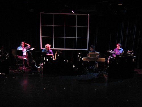
This is the lights for the band, and nothing else. It's pretty easy to see where the two different colors of light come from. If you look at James, the drummer on stage left, he's wearing a blue shirt. His left (not stage left) is bright blue, while his right side is more of a purple color; that's what you would expect--a blue shirt will reflect most of the blue light shining on it, so it will appear brighter. That same shirt will turn purple under reddish (in this case pink) light because it is absorbing some of the red.
The idea for these lights was to make the band look like part of a jazz club or something, and I think it succeeded pretty well with that; they look hip and cool.
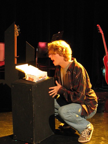
The Piano
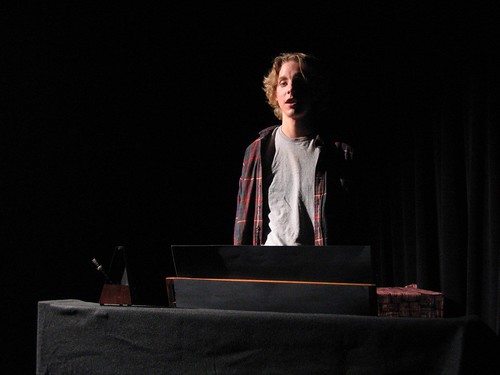
This is Jon's (played by Ian) opening monologue from behind his piano. He is being lit by one main light, which is the one I mentioned earlier that was focused on the piano. If you take a look at the plot, and then take a look at this photo, I think it's pretty obvious what's going on. The light is coming from mostly stage right, so it cuts off half of his face. This makes him dark and dramatic-looking. The lighting wasn't actually that extreme; there is some fill light here coming from stage left, but you can't see it because of the camera exposure. Also, this is what a "cool" light looks like. It's not blue at all, but it's more as if you went to your television and turned the red tint down; the red colors are just a little bit muted, and it makes his face a little paler.
"30/90"
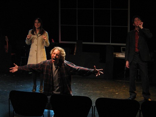
This shot is from the end of the first song, "30/90". This isn't nearly as bright as it would have appeared to an audience member, but that's part of the problem of taking pictures of theatre; it'll never look quite right. Still, you can see some of the lighting ideas in action.
To start, I'm using the backlights pretty heavily. The woman on stage right is Jess, playing Susan. See the blue outline around her coat? That's what I'm talking about when I say that backlighting gives people a kind of halo, makes them glow a bit. It makes her pop and sparkle, just like an outline does in a painting or drawing. The guy at stage left is Michael, played by Erik. He has the same thing going on, except with one of the yellow back lights. It's not as obvious, because he's not wearing a fuzzy coat, but look at his face, on his cheekbone, on his left (not stage left) side. See the orange highlighting there? It's also glancing off of his shoes and the back of his right pants leg, and a teeny bit off of his left coat pocket.
Now, on to Jon. He's the main character, which makes him the center of attention. Now, obviously he's commanding your attention with his body posture, but the lighting is helping. He's under a top light (which the other two are not), so his face is brighter--that draws your attention to him. The toplight also makes his hair glow, and his face has more contrast between the light and dark parts (in other words, the shadows are darker compared to the light areas). This makes it more interesting visually; look at Susan and Michael--their faces are flatter by comparison.
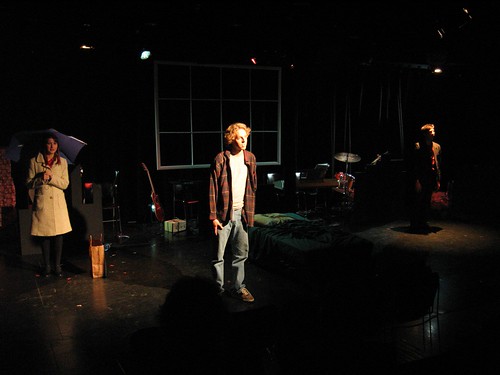
Bedroom Scene
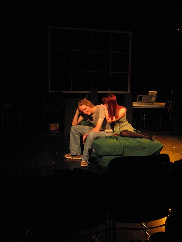
This scene is in the bedroom of Jon's apartment. Notice that the strong top light is gone; there are no weird shadows here. The color temperature is also much warmer--compare Jon's skin tone here to his tone in the piano picture; there's a lot more red in it. This lighting is a lot more realistic; it's meant to mimic more closely what you might get from a room lit by a couple lamps with shades--a very even wash of warm light with few shadows. The backlight is just to fill in the back a teeny bit, and make the whole thing even. Also notice that the rest of the stage, where there is no action, isn't lit--this keeps the whole thing feeling close and intimate.
Twinkie Worship
In this scene, Jon is worshipping a package of Twinkies. It's a pretty crazy, over-the-top song, which is why the lighting is over-the-top. The backlight here is going full blast, and you can see it makes the Twinkie box glow like it was on an altar or something--totally dumb, but it was a visual joke.
Actors on Boxes
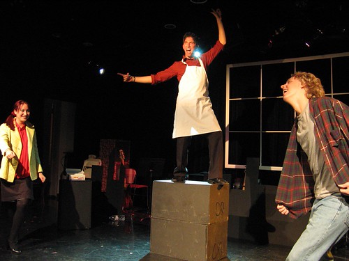
This is what I was talking about when I said that people who stand on boxes can totally screw up your lighting. I had to hang a special light in order to keep Michael's face lit for this scene where he jumps on a box for all of three seconds. On the plot it's near center stage, not focused on any area, a Source IV on dimmer 22 with no gel.
You can tell that the light is basically hitting Michael straight on in the face if you look at his shadow on the window thingy in the back--it's directly behind him. That gives you an idea of how low the ceiling is in here. Also, you can see that his hand above his head is much dimmer than his face--that's how easy it is to get out of the light if you move vertically, and it's why it was so difficult to light for this show, since Susan was of average female height, while Jon was very tall for a guy. A foot or two makes a huge difference.
Also, note the blue backlight. Not only does it make him glow a bit (look at his outstretched hand, the glow through his apron, and his shoes), but it also is a visual element in and of itself. Michael jumping onto the boxes is very sudden, so it's already a surprise to the audience, but then when they look up at him, they find themselves staring straight into the light, which gives the whole thing an added punch.
"Just Wanna See Her Smile
In this song, Susan breaks up with Jon, and since it's a musical, they sing about it. Michael makes an appearance in the song, but throughout the whole thing, no one is ever really in the same place as anyone else, so they have to look different.
Notice that Michael is almost exclusively toplight, which makes him interesting to look at but obviously not as bright as everyone else. He's a presence, but not a strong one. Jon is the brightest and of the three, so he stands out, as usual, and Susan is kind of a mix. She has some toplight (which you can see glancing off the umbrella--the umbrella was an element I wasn't expecting; it blocked a lot of light), but also some light from the front. They each have slightly different presences on stage, their own little worlds that they're in.
Conclusion
There you have it! A detailed look at the lighting of
Tick, Tick...BOOM!. If you made it through all 7,300 words or so, give yourself a pat on the back, and even if you didn't, I certainly hope you enjoyed reading this. Feel free to leave questions or comments. My posts from now will probably be shorter, although not necessarily more frequent.
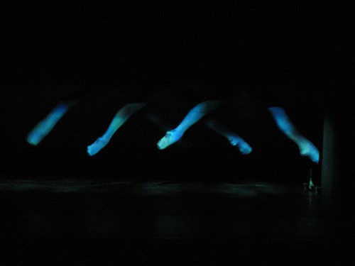
 For lights in "Swan Lake", I just used a light pink color, to bring out the pink and red tones in the shoes. I used no side lighting because I didn't want to light up anything but the legs, and side lights would have allowed the audience to see bits of the stage and things behind the dancers. I used two Source 4's from the balcony rail, and shuttered them so that they both made squares of light on the box.
Once the pointe shoes finished, the light went back to the dancer sitting on the apron while the dancers changed costumes for the next dance. The curtain went back up to reveal the same box, but this time the music was reminiscent of orca whales, and the dancers clad in mottled blue-green tights. The went floating across the box, using two parallel bars out of side of the audience. Here's a picture of what we called "Whales":
For lights in "Swan Lake", I just used a light pink color, to bring out the pink and red tones in the shoes. I used no side lighting because I didn't want to light up anything but the legs, and side lights would have allowed the audience to see bits of the stage and things behind the dancers. I used two Source 4's from the balcony rail, and shuttered them so that they both made squares of light on the box.
Once the pointe shoes finished, the light went back to the dancer sitting on the apron while the dancers changed costumes for the next dance. The curtain went back up to reveal the same box, but this time the music was reminiscent of orca whales, and the dancers clad in mottled blue-green tights. The went floating across the box, using two parallel bars out of side of the audience. Here's a picture of what we called "Whales":
 For lights in this I also used Source 4's from the balcony rail, but this time I used two different colors: a blue-green and a green-blue. They were close in color, but I like to think that they helped accentuate the costumes, although it's hard to tell. I also used gobo scrollers in each light, set at a very low level, so that there was actually a mottled pattern to the light which slowly changed and shifted throughout the piece. I doubt anyone noticed it, but when I didn't have the gobo scrollers working, there was definitely a static quality to the light which I didn't like.
Lastly, the light when back to the dancer on the apron, but this time her light stayed up as the curtain went up on a full stage. The dancers were clad in rehearsal clothing, and the music was a tentative piano piece. Every so often, snippets of a symphonic string piece could be heard fading through the piano music. Each time this happened, I brought the lights up a bit, so the brightness was gradually increasing throughout. At the end, the dancers took off their rehearsal costumes to reveal full performance dresses. Then the piano disappeared, the symphony music began, and it was time for the "real" performance. For this, I brought most all of the lights up to full blast.
I don't have pictures of the interim parts, but I do have shots of the full performance lighting. Here are a few:
For lights in this I also used Source 4's from the balcony rail, but this time I used two different colors: a blue-green and a green-blue. They were close in color, but I like to think that they helped accentuate the costumes, although it's hard to tell. I also used gobo scrollers in each light, set at a very low level, so that there was actually a mottled pattern to the light which slowly changed and shifted throughout the piece. I doubt anyone noticed it, but when I didn't have the gobo scrollers working, there was definitely a static quality to the light which I didn't like.
Lastly, the light when back to the dancer on the apron, but this time her light stayed up as the curtain went up on a full stage. The dancers were clad in rehearsal clothing, and the music was a tentative piano piece. Every so often, snippets of a symphonic string piece could be heard fading through the piano music. Each time this happened, I brought the lights up a bit, so the brightness was gradually increasing throughout. At the end, the dancers took off their rehearsal costumes to reveal full performance dresses. Then the piano disappeared, the symphony music began, and it was time for the "real" performance. For this, I brought most all of the lights up to full blast.
I don't have pictures of the interim parts, but I do have shots of the full performance lighting. Here are a few:
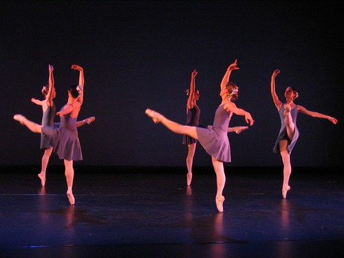
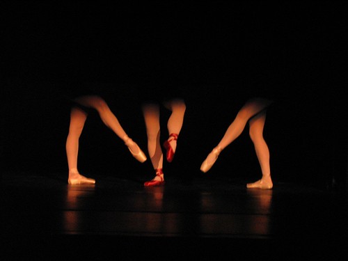
 This photo, incidentally, is a good look at how light can give shape and definition to a person. Take a look at the front most dancer. First, look at the leg she is standing on. Notice that the right (stage left) side of her leg has a bit of extra brightness to it, but overall, the leg is essentially illuminated the same amount over its entire visible area, left-to-right.
Now, look at her upraised arm. See how both sides are significantly brighter than the center, and there is a long, smooth gradient between light and dark areas. This gives the arm shape and definition--you know it's an arm, instead of just a flat piece of cardboard shaped like an arm, because those shadows exist because of the three-dimensional shape of the arm.
Ideally, in a dance, you want everything to be shaded like her arm, not like her legs. However, many choreographers want lots of "face light"--frontal illumination, so you can see the dancers' faces. Sadly, frontal illumination "flattens" dancers by making them look like cutouts. It's kind of a compromise between light designer and choreographer as to how much face light there is, sometimes. In this case, the dancer's upraised arm is above the level of the front lights, while her leg is right in it, so the leg is flat while the arm is shaped.
I actually think the front light worked well in this case--this dance was very much about the stereotypes and clichés of pointe ballet, so making the dancers look somewhat flat and two-dimensional actually gave the piece a nice effect.
This photo, incidentally, is a good look at how light can give shape and definition to a person. Take a look at the front most dancer. First, look at the leg she is standing on. Notice that the right (stage left) side of her leg has a bit of extra brightness to it, but overall, the leg is essentially illuminated the same amount over its entire visible area, left-to-right.
Now, look at her upraised arm. See how both sides are significantly brighter than the center, and there is a long, smooth gradient between light and dark areas. This gives the arm shape and definition--you know it's an arm, instead of just a flat piece of cardboard shaped like an arm, because those shadows exist because of the three-dimensional shape of the arm.
Ideally, in a dance, you want everything to be shaded like her arm, not like her legs. However, many choreographers want lots of "face light"--frontal illumination, so you can see the dancers' faces. Sadly, frontal illumination "flattens" dancers by making them look like cutouts. It's kind of a compromise between light designer and choreographer as to how much face light there is, sometimes. In this case, the dancer's upraised arm is above the level of the front lights, while her leg is right in it, so the leg is flat while the arm is shaped.
I actually think the front light worked well in this case--this dance was very much about the stereotypes and clichés of pointe ballet, so making the dancers look somewhat flat and two-dimensional actually gave the piece a nice effect.
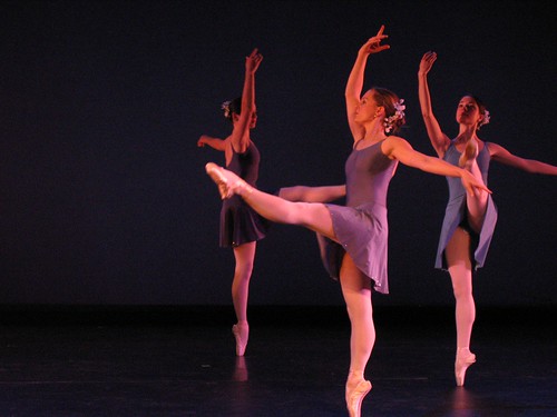
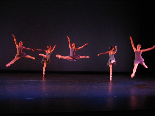 I love this photo.
Anyway, for this dance I used plenty of front light, at Christine's request. I also used blue "cyc" (short for cyclorama) lights on the back to set off the shape of the dancers. Then I used warm side lights to give them that definition I talked about earlier. Finally, since the front light tended to wash out the blue on the cyc, I added some pretty bright blue back lights, which gave all the dancers a subtle blue halo. You can see it in some of the pictures if you look closely (you'll probably have to look at the large versions). I also used blue and yellow high side lights, which added to the kind of definition the sidelights gave.
And that's that. I'll post stuff on Ipi Zombi when I get the chance.
I love this photo.
Anyway, for this dance I used plenty of front light, at Christine's request. I also used blue "cyc" (short for cyclorama) lights on the back to set off the shape of the dancers. Then I used warm side lights to give them that definition I talked about earlier. Finally, since the front light tended to wash out the blue on the cyc, I added some pretty bright blue back lights, which gave all the dancers a subtle blue halo. You can see it in some of the pictures if you look closely (you'll probably have to look at the large versions). I also used blue and yellow high side lights, which added to the kind of definition the sidelights gave.
And that's that. I'll post stuff on Ipi Zombi when I get the chance.
 This is my apartment room under Rosco 14, which is the warm color that I used for the backlights in my previous post.
 This is my room under Rosco 44, which is the pink color that I used for the band.
 This is my room under Rosco 72, which is the blue color that I used for the band.
You can see that these are all pretty saturate colors. The only difference here is that a camera flash is a little bit cooler than a theatrical lighting instrument, so all of the pictures are a bit bluer than they might normally be.
This is my room under Rosco 72, which is the blue color that I used for the band.
You can see that these are all pretty saturate colors. The only difference here is that a camera flash is a little bit cooler than a theatrical lighting instrument, so all of the pictures are a bit bluer than they might normally be.

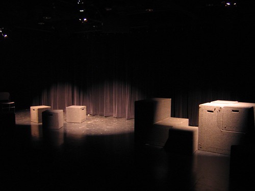 Notice how the light is all coming from approximately the same direction, and how it gives the scene a bit of a cozy feeling.
Compare that to the same set of blocks lit by the three upstage cool fixtures.
Notice how the light is all coming from approximately the same direction, and how it gives the scene a bit of a cozy feeling.
Compare that to the same set of blocks lit by the three upstage cool fixtures.
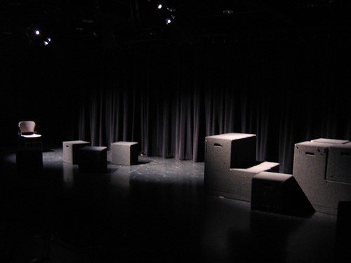 The light distribution is approximately the same (although it is coming from a different direction), but the overall look becomes more subdued, less friendly.
Now, take a look at what the top lighting looks like by itself.
The light distribution is approximately the same (although it is coming from a different direction), but the overall look becomes more subdued, less friendly.
Now, take a look at what the top lighting looks like by itself.
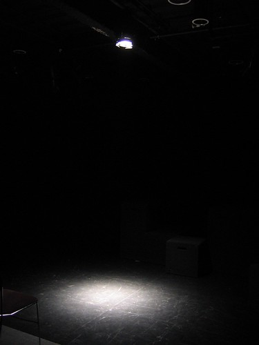 It's tough to see, since there's nothing underneath this to give you an idea of how the light plays on an object, but this top light will give lots of definition to the eyes, nose and mouth, since they are protrusions or sinks that don't get lit or get lit more brightly than the rest of the face. This makes it very dramatic lighting, an effect which is heightened by the fact that it is also very isolating to put someone in a pool of light like this, with the rest of the stage dark.
Lastly, look at everything put together:
It's tough to see, since there's nothing underneath this to give you an idea of how the light plays on an object, but this top light will give lots of definition to the eyes, nose and mouth, since they are protrusions or sinks that don't get lit or get lit more brightly than the rest of the face. This makes it very dramatic lighting, an effect which is heightened by the fact that it is also very isolating to put someone in a pool of light like this, with the rest of the stage dark.
Lastly, look at everything put together:
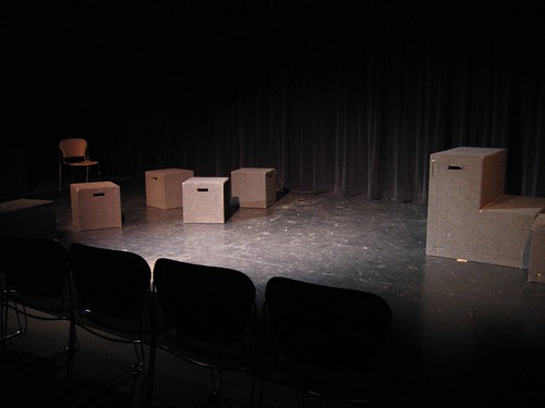 This is both colors of front lights, plus some top lighting in the center section. See how the cool and warm combine to produce approximately white, and also notice that everything maintains some texture because the lights are coming from different angles, providing shadows.
That's about all I've got for now. My next post will cover the lighting plot that I am using for Tick, Tick...Boom!, which is significantly more complicated than the rep plot here, although you will see that I incorporate many of the same ideas.
This is both colors of front lights, plus some top lighting in the center section. See how the cool and warm combine to produce approximately white, and also notice that everything maintains some texture because the lights are coming from different angles, providing shadows.
That's about all I've got for now. My next post will cover the lighting plot that I am using for Tick, Tick...Boom!, which is significantly more complicated than the rep plot here, although you will see that I incorporate many of the same ideas.