I recently designed lights for
Young Choreographers' Showcase 2006 (YCS), which is a biennial dance show that WashU puts on to, well, showcase the works of student choreographers.
Earlier this year, I designed lights for another dance concert,
Style/Form, which was a senior thesis performance for Justin Huebener and Allison Califano. I didn't get a chance to write a post about it, but that show was a really great experience for me; I learned many valuable lessons about designing dance shows (see the post below this one).
Style/Form also took place in the same performance space as YCS, which meant that I got to leave most of my lights hung.
Since I already had most of the equipment already in the space, tech for YCS was a very pleasant process; there were no late nights in the theatre, and since I had tech support (in other words, warm bodies to do my bidding, and a budget), I didn't have to do everything myself.
At least in part because tech was so nice, I think the lights for YCS turned out very well, and I just got hold of some pictures of the performance, so I'm excited to get those posted and discuss them a bit.
I didn't take most of these photos; I believe I am within my rights to post them, since this size is freely available from David Marchant, the photographer, but don't ask me if you want to copy them or something--ask him. I did take the shots that are from
Style/Form, however, and those are Creative Commons licensed, so do whatever you want (so long as you follow the license).
Also, if you have access to a CRT monitor, I recommend it for viewing these photos--the colors will be much nicer on a CRT than they would be on an LCD.
Exposure
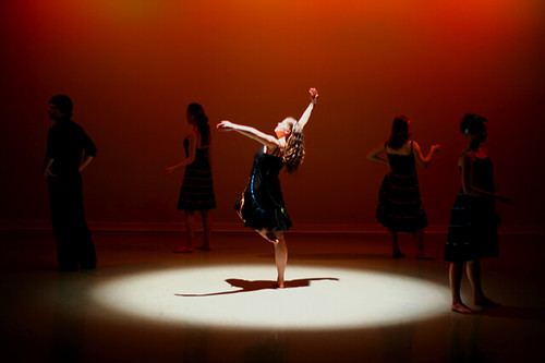
Allison Califano
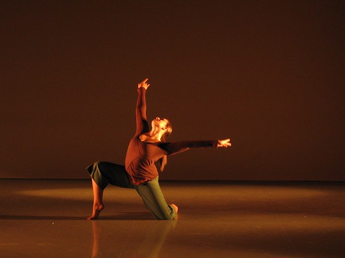
This piece was a repeat from
Style/Form, and it was very fast-paced and angry. Allison wanted a leafy, foresty look, so she asked for patterns on the dancers, and in
Style/Form, I wasn't able to get it to work very well. However, with a second chance at it, I used more saturate colors and changed the instrument focus a bit, and the leaf patterns showed up quite well this time, I think.
An unexpected side effect of the bright green cyc is that whenever the dancers were in silhouette, they left weird blue streaks as they moved. It was clearly a trick of the eyes, but it still looked very cool.
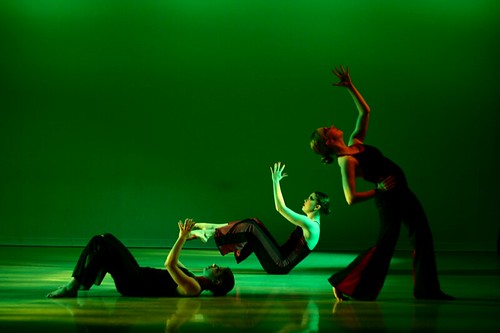
Decompose. Recompose
Heather Wigmore
Heather didn't really have any clue what she wanted in the way of lighting, so I took the opportunity to play a bit, and use a lighting technique that I've seen Charlie Chapman use from time to time: having intense complementary colors from opposite angles. Where the lights blend, they create white, and the shadows cast by each light are actually the areas
illuminated by the other color, so it actually makes all the shadows colored rather than black, which I think looks neat.
I don't think I was completely successful in mimicking Charlie's work in this piece, but I still like the overall effect, especially on her face.
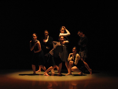
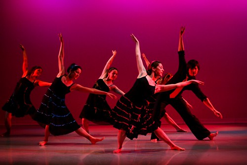
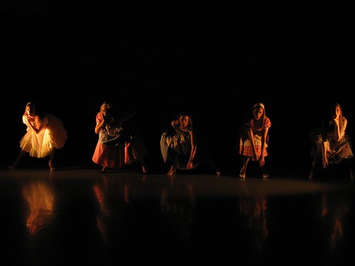
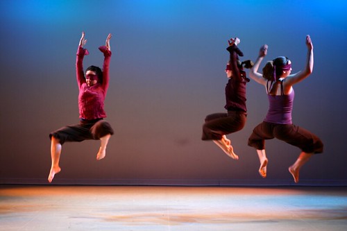
Alone Everybody
Laura Vilines
This dance was divided into three sections; I am posting pictures of the first and last section. This dance discussed themes of solitude and becoming part of a group. All of the lighting is very saturate because Laura wanted bright colors (look at the accents on the dresses).
The first section is the orange one, and it was a short solo section for Laura; she stood in that pool of light and considered breaking out of it, but never really managed to. That's the solitude part.
The second scene was blue, and involved lots of group work. That represented the group--what everybody else was doing.
The third section is the red photo, and it involved similar choreography to the second section, except this time it told a story about a girl going from solitude to becoming part of the group.
My lighting for this dance very closely mirrored the music; it was bright and fun and happy, and for the last piece ("It's Oh So Quiet" by Björk), I went with the mood changes almost exactly. This seemed to work, because the choreography was very open and forthright.
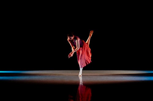
Drifting into Focus
Patricia Engel
The lights for this happened by accident--because of the white floor, any lights that shine on the floor are very visible. When I turned on the side lights with an intense blue color in them, I created those really nice-looking symmetrical scallops on either side of the stage. Because this was a very symmetrical, structured piece with music that sounded a lot like Philip Glass or Brian Eno, I immediately had a "eureka!" moment when I saw those scallops on either side.
As you can see, Patricia's costume is pink and purple, so I used the blue scallops to accent her costume, and then I used pink in the mid and high side lights to make the costume and her skin seem warm and mellow. The eureka part was when I realized that her dance enters from the upper-right corner of the stage, moves downstage, and then goes back out that part of the stage. I followed the dance by turning on the alleys of side light one by one, from upstage to downstage, and then turning them off in reverse order, and I think it looked great.
This was probably my favorite piece of the show.
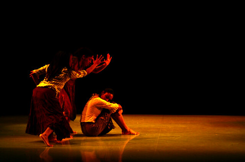
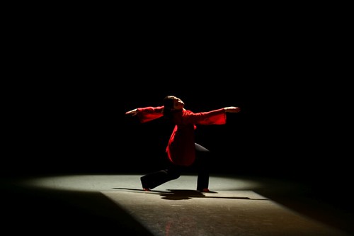
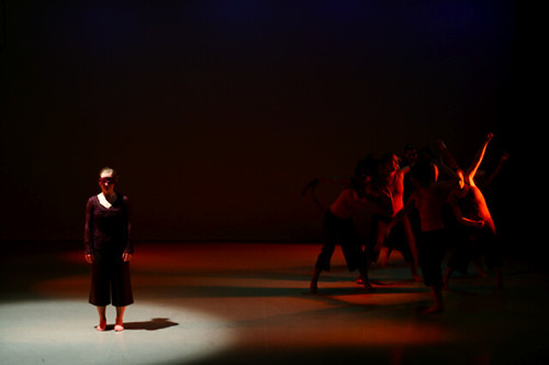
Sorrows of the Past
Marquita Redd
This piece was about black people in the South getting lynched. It was a repeat from Marquita's thesis, but I didn't design lights for that, so I essentially re-created the lights from scratch, based on what she told me her original designer had done.
I didn't really enjoy this piece, just because I thought the theme was overdone, but the lighting came out quite nicely; I've noticed that reds and yellows do a good job of accenting dark skin.
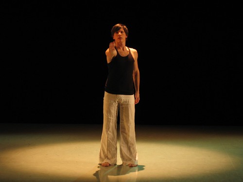
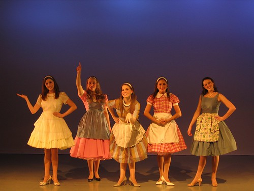
You Must Meet My Wife
Justin Huebener
This was another repeat from
Style/Form, and I'm really glad I got the chance to re-do it--I just wasn't happy with the lights for it the first time, and I think they were much improved this time around, even though all I really changed was that I used more saturate colors.
The picture, however, isn't from YCS, it's from
Style/Form, so you don't get to see how much better things looked, sadly.
Basically, this piece was about sexual repression in the 1950s, I think. That makes it sound rather pompous and dreary, but it was actually just a heck of a lot of fun; the dancers maintained expressionless faces throughout most of the dance, making robotic sexual gestures and movements, and everyone was cracking up the whole time.
It was set to "Hey Big Spender" from
Sweet Charity, and the dancers were pretty much acting out a weird robot version of that in big frilly dresses, so you can probably imagine how strange it was.
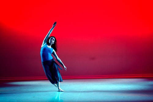
Nostos
Meredith Wilensky
This dance also included a eureka moment; when Meredith started asking for lights that kept her in a pathway up and down center stage, I realized that a rectangular path from the back would look great, so I added that as a special. Then I saw her costume, and things got even better, because as you can see, the fabric of her shirt was a translucent red material that glowed just beautifully under the backlighting that I had.
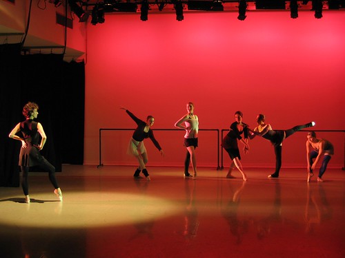
Unbounded
Jenny Boissiere
No, you're not imagining things; the dancers really are wearing blindfolds. Luckily, the blindfolds were thin enough that they could see through them reasonably well--so long as the lighting was bright enough. My first priority with this dance was clearly to prevent collisions, so I just picked colors that I thought went well with their costumes, and then turned everything up full blast. Not particularly creative, but it still came out nicely.
The music for this was really cool a cappella beat-boxing. Throughout the dance, one by one, most of the members of the company took off their blindfolds. I thought it would be really cool to make them go dark as they took their blindfolds off, to kind of invert the audiences expectations of what happens when you remove an impediment to clear sight.
However, that ended up being not really possible given the choreography, and it would have been semi-dangerous for the dancers who were still blindfolded, so I settled for just changing the color on anyone who wasn't blindfolded.
By the end, only one dancer was left with a blindfold, and you can see in the second photo that I got my chance to make the blindfolded person light, and the un-blinded dark, which I was happy about.
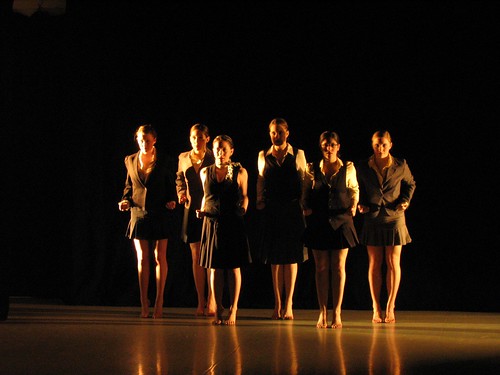
Happening
Rebecca Hutt
This was a cute little piece that I really enjoyed. It had already been performed at the American College Dance Festival, so someone designed lights for it there, and I mimicked what they did based on description. I admit that I probably wouldn't have come up with this particular color scheme on my own, but I really liked it, and I'm going to add this type of look to my bag of tricks. I only wish the floor weren't so reflective, because the red on the back wall kind of turns into purple near the bottom, as it blends with the blue from the stage wash.
And, that's all the dances in YCS 2006--I hope you've enjoyed reading about them!
Just for fun, here are some shots that I took myself from
Style/Form. My camera isn't great though, so these aren't of the highest quality.