Saturday, May 26, 2007

Pillow Posts -- Day 5

We've done a ton of work in the past two days. Yesterday was our first major work day, and we did a bunch of rigging, cleaned out the Duke, and countless other miscellaneous projects. The production staff said they were very happy with the work we did, which I'm actually not too surprised about--it has been pretty clear since the first day that even the least experienced production intern has done plenty of tech theatre work; most of us are tech majors of some form, and several people have significant professional experience. In short, we have a top-notch tech team.

Today was "cleanup day," otherwise known as "get-the-festival-looking-like-a-festival-rather-than-a-farm-day." We washed windows, extracted chairs from the Pillow Pub, and vacuumed the Shawn lobby. Among other things. The place looks mostly ready for the general public now--it has been a pretty amazing transformation.

I don't really have anything else to write about today, except that I haven't yet decided whether I hate black flies or mosquitos more. Black flies are like little vampires--they puncture your skin and then crouch at the edge of the wound like little vampires, lapping up the blood. It's absolutely disgusting. Mosquitos, on the other hand, come in swarms, and their bites are itchier.

Friday, May 25, 2007

Pillow Posts -- Day 4

Pillow Posts -- Day 4

Today is history day! We had a lot of history education yesterday, and I want to pass some of that history along to you all, because the significance of this place to dance is huge. I'm going to quote a few dates and figures--they may not all be precisely correct, but they'll be accurate to within five years or a decade or so.

Jacob's Pillow was originally a farm; it was bought by Ted Shawn in the late 1920s, and he used it to start the company of all male dancers which would become known as "Shawn and His Men Dancers." Dancers at that time were almost exclusively female, in the European tradition, and so having a troupe of male dancers was quite a sensation. The dancers were amateurs, many of them athletes from a college where Shawn taught.

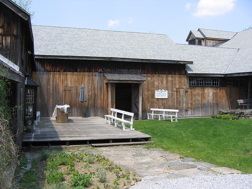
The Men Dancers were working together at the worst time in the Great Depression, so they farmed their own food and worked together to erect buildings specifically for dance, including what is now the Bakalar Studio. In order to raise money for the company, they held parties in the Tea Garden, shown below, where the dancers would serve tea. Shawn would give lectures on his choreographic methods, after which the dancers would do a performance. The audience members were usually rich old dowagers, and the mens' costumes were rather scanty, so, according to one of the Men Dancers, it became a rather popular event quite quickly. A photo of the Tea Garden is below.
Library - 121.jpg

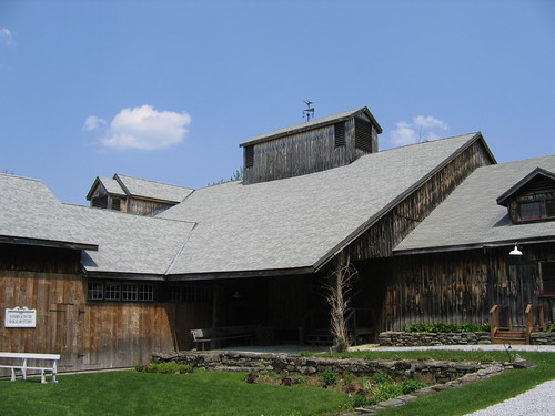
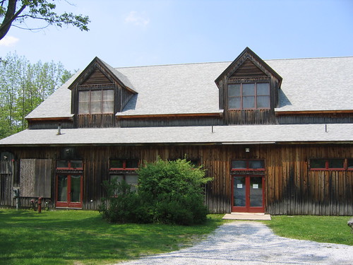
The Ted Shawn Theatre, shown below, was built in 1930, and it is the Pillow's main performance space. It seats about 650, and over the years, it has seen performances by nearly every major name in dance. It is traditional for performers to sign their names on the walls of the dressing rooms, so you can see names like Merce Cunningham, Alonzo King, and Alvin Ailey on the walls, to name a few (I haven't actually found these names, but I know they've performed here, so I assume they're around). The weathervane on top is modeled after a pose struck by Barton Mumaw, one of the original Men Dancers, in a piece choreographed by Shawn.
Library - 120.jpg
Library - 119.jpg

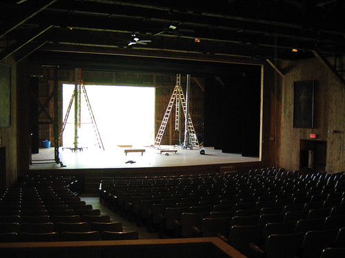
For the techies among you, the Shawn, as we call it, has a fly system, but because the roof is shaped like a barn, we don't have any fly space to speak of, so we can't fly out large objects. Also, the rigging system is single purchase hemp rope, which is about as low-tech as you can get with a theatrical rigging system. This means that the people pulling the ropes carry the full weight of whatever is being flown. If what you are flying is 500 pounds of rice, they have to hold up 500 pounds. The rice story is not just a random example; several years ago, a Korean company wanted to drop 2,000 pounds of rice from overhead like snow, and they actually did it.

The reason the Shawn is low-tech is not for lack of money; it's actually deliberate. Not only does the Pillow staff deliberately cultivate a rustic feel, but since the entire campus has been named a National Historic Site, there are actually limitations to how much the existing buildings can be changed. It's kind of an interesting side effect of historical significance--you can't changed anything.

An interesting note about the Shawn is that because it is built entirely of wood, it is apparently a great venue for rhythmic dances such as clogging and tap because audience members can feel the vibrations of the dancers' footfalls in their seats. I say apparently, because I haven't seen any shows in there yet, obviously. There aren't any pure tap or clogging groups on the roster for this summer, but I think some of the companies will be percussive in part, so I hope I'll be able to report on the accuracy of that claim.

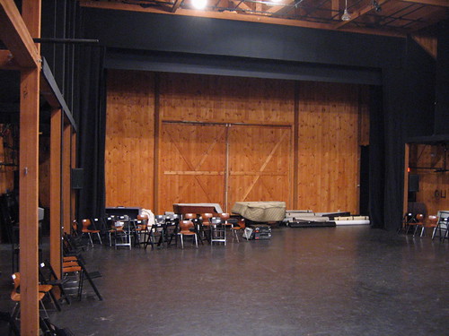
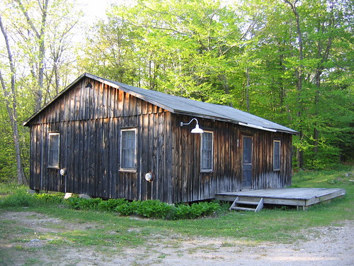
The Doris Duke Studio Theatre, shown below, was built in 1990, but as you can see, it closely matches the styling of the Ted Shawn Theatre. This is due to the low-tech atmosphere I mentioned above. Both the inside and the outside have bare wood paneling, and it even has giant barn doors, like the Shawn. However, it has a permanent grid, unlike the Shawn, and air conditioning, also unlike the Shawn. We'll be doing some interesting things in there this season, like flying people. The theatre was originally conceived as a flexible seating space, but apparently no one ever wanted to change the seating layout, so at some point they decided to simply make the seating arrangement permanent.
Library - 122.jpg
Library - 123.jpg

As a side note, one of the pianos on the stage is apparently an 1850s Steinway Grand. I'm very excited to hear it play.

Thursday, May 24, 2007

Pillow Posts -- Day 3

Pillow Posts -- Day 3

We didn't do very much today; we continued to have lots of orientation meetings and tours, but we did no actual work--that starts tomorrow. Apparently there will be bears on campus at some point, and I got bitten by a black fly, which leaves a really annoying red bite mark.

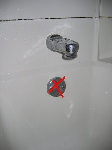
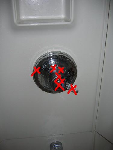
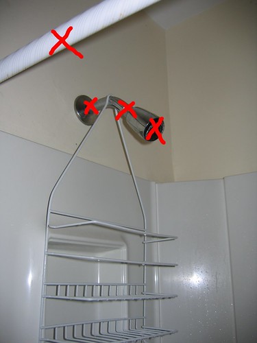
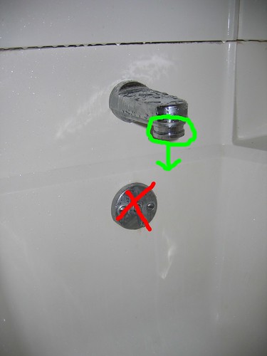
The adventure of today (well, last night, actually) was trying to figure out how the shower works. Most showers can be grokked by simply jiggling every knob you can find until it does what you want (this applies to most machinery in general, by the way). However, this faucet did not give up so easily. I could turn on the water, and I could change the temperature, but I could not for the life of me figure out how to get the water to come out of the shower head instead of the bathtub faucet. On the following pictures, I have marked all the different things which do not accomplish that goal.

Library - 117.jpg
Library - 116.jpg
Library - 115.jpg

So what does work? You have to grab the actual faucet head and pull down. You know, the faucet head, the part that is normally made out of solid metal and which doesn't move and which normal, intelligent people would never ever in a million years assume to be any sort of water control because it looks like it's a single piece of steel.

Library - 117_grn.jpg

That's pretty much all for today-- I have a lot to write about the history of Jacob's Pillow, because we learned a lot about that today, and it's really fascinating, but that's going to be a pretty long post, so I'm going to delay that one until I have a little more time, which may not happen for a couple weeks.

Our work schedule for the next few weeks looks something like this:
9AM-11AM
15 minute break
11:15-1:15
Lunch
2PM-4PM
15 minute break
4:15-6:15PM
Dinner
7PM-11PM

Sounds like fun to me!

Wednesday, May 23, 2007

Pillow Posts -- Day 2

Most of the rest of the interns arrived today, and they all seem to be a really cool bunch. There are people from all over, and everyone is very friendly and willing to introduce themselves. I've made a special effort to try and remember names, and I think I've got about 50% by now, which is excellent for me, since I usually only get one or two on the first day at a new place. Luckily, we'll have nametags starting tomorrow.

We had our first extensive tour of the Pillow today, and I'm pretty happy with the facilities. They're much different than you might expect for a world-renowned festival; everything is consciously kept to a very rustic feel, and the construction is almost exclusively bare wood. It makes the place feel a little less sophisticated than say, the Power Center in Ann Arbor or the Edison in St. Louis, but the spaces themselves are clearly quite capable of putting on just about any performance.

The main thing that is different from what I expected is that because this is a summer festival, absolutely everything has to be loaded in from scratch to the theatres at the beginning of each season. This includes marley flooring, curtains, lights, sound, and even dimmer racks. There are eleven tech interns and nearly as many tech staff, but even so, with two major indoor performance spaces, one outdoor performance space, and two indoor dance studios, getting this place ready for festival time in two weeks is going to be a huge undertaking. Everyone tells us we'll be working around the clock for that time, which I completely believe.

We were informed on the campus tour today that bears are quite common. If I see a bear, I'll be sure to take a picture before I run screaming into the woods.

A group of us went jogging this evening, and we were nearly run over by a giant dump truck whose driver somehow thought that driving with his lights off on a winding mountain road would be a good idea.

My observation for the day is that theatre is a small world. One girl I met goes to Western Michigan and knows Matt Baker and David Curwen. I knew Matt in high school, and I designed lights for David's dance at WUDT this year. Another girl went to Webster in St. Louis and knows Pat Vacek and Cecil Slaughter. Pat is my former roommate's younger brother, and Cecil is an instructor at WashU.

My second observation for the day is that people repeat themselves. I met one guy who I swear is the twin brother of Scott, a guy I knew at WashU. They don't look much alike, but their speaking patterns and physical movements are almost identical. Another girl could be the twin sister of Ayesha; it's uncanny. I'm sure that this is my pattern-seeking brain forcing people into bins (read On Intelligence for more about that), but for now, the resemblances seem uncanny.

My reading for my trip yesterday was Hackers and Painters by Paul Graham--it's a pretty good book if you're someone who wants to learn more about the minds of computer geeks, or if you're a computer geek who wants to learn more about the minds of other computer geeks. I finished that this morning, but luckily, Cameron (operations coordinator) informed me that there was a box of books for a book exchange. Unluckily, they were all mystery novels. Not that I have anything in particular against mystery novels, but I like having variety. I picked The Third Truth by Michael Bar-Zohar and started reading. It's decent; nothing too original, but nothing outright bad, either.

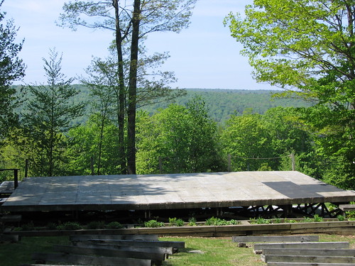
Picture for the day: the view from the back of the house at the Inside Out stage. This is where we will be holding free outdoor concerts.

Library - 112.jpg

Tuesday, May 22, 2007

Pillow Posts -- Day 1

I am now broadcasting live from Jacob's Pillow in Massachusetts! The trip here, despite being composed of a plane ride, followed by a bus ride from the airport to the regional bus depot, followed by a three-hour layover, followed by another bus ride, followed by a car ride to the actual site, was pretty stress-free.

I arrived by about 4:30, and I met a bunch of the staff, who all seem to be really friendly, including the tech folks, who have that same combination of laid-back joviality and quirkiness that I have come to associate with tech people everywhere.

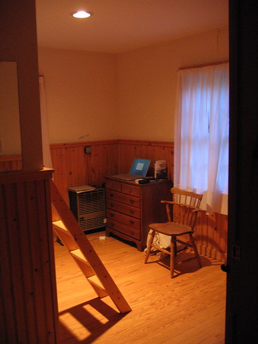
The housing is one step above Interlochen (they have heat!), for those of you who have lived there, but it's not a hotel or anything. I'm in a double room, in a cabin with four double rooms. I count five intern cabins total, but there are only six or seven male interns (out of 31 total), so it's possible I may not have a roommate, assuming they don't have co-ed cabins.
Library - 106.jpg
Library - 108.jpg

My big observation so far is that the East Coast is nothing like the Midwest. Everything is much more compact here. There seems to be a much sharper boundary between civilization and wilderness. In the Midwest, you have to drive through innumerable ultra-generic middle-class subdivisions with meaningless names like "Marmoset Valley Heights" before you can get away from the urban sprawl, and even once you manage that, you're really in farmland, not wilderness.

Here in the Berkshires, on the other hand, there are only buildings where there are roads, and there are only roads a) in towns and b) connecting towns. Everything else appears to be nothing but trees. Despite that, I'd be willing to bet that they have about the same overall population density on a statewide level that we have in the Midwest, because they cram more people into smaller areas. I kind of like it--urban sprawl bugs the heck out of me, and trees are pretty. I hope I'll have time for hiking.

I'm one of only two or three interns who arrived today--the rest are showing up tomorrow. Everyone has told me to get settled in and enjoy what they say will be my one and only quiet evening of the summer. I just read the orientation packet they gave me, and the last page was a list of tips for surviving the summer. The number 7 tip?
"Breath. Often. Deeply."

Monday, May 21, 2007

Broken pictures in old posts

I just realized that due to me canceling my .Mac subscription, many photos from my earlier posts have disappeared. If anyone makes a request, I will fix them, but not until after the summer is over. Sorry about that.

Leaving on a Jet Plane

I'm heading to Jacob's Pillow tomorrow; my flight leaves at 10:18AM EST. I have been reading a brochure about their coming season, and here are some performances I am really looking forward to:
  • Aurélia Thierrée of France, who works using techniques from acrobatics, clowning, and puppetry.
  • The U.S. premieres of two Netherlands-based companies, Nederlands Dans Theatre II, and Club Guy & Roni.
  • The U.S. premiere of Mimulus, a Brazilian group which combines tango, theater, and contemporary dance.
  • Hubbard Street Dance Chicago--I've heard these guys are great, and I'm excited to see them.
All the other stuff on the program looks great as well, and I will blog about as much of it as I possibly can. Pillow policy is that I may take photos for personal use, but that I may not post them to the Internet without permission. I plan to seek permission to post pictures here, but if it is denied (as I expect it will be), I will probably just send pictures to anyone who asks. Please subscribe to my RSS feed; I expect this summer will be an exciting one!

Sunday, April 22, 2007

Blogging Jacob's Pillow

Well, it seems that my attempts at blogging about theatre during this school year have been a miserable failure. The problem with doing theatre is that it's usually so life-consuming that you don't have time to do other things, such as write about it.

However, I'm hoping that will change this summer. From May 22 through August 30 I'm going to be doing dance tech up at the Jacob's Pillow dance festival. I'm told we get Mondays off (whee!), so at the very worst, I should be able to manage weekly blog posts. I'm sure I'll be learning a lot, and whatever I learn, I'm going to put here, so that you all can keep track of what I'm up to.

I'll try to take pictures too, so it'll almost be like I'm sending postcards, except I only have to write them once--see how efficient the Internet makes me?

Anyway, for the next few weeks I'm going to be concentrating on important non-theatre things like graduating. But I hope to really bring this blog to life this summer.

Saturday, December 30, 2006

HickoryDickory Wrap-Up: Lesson 3

This is the third in a continuing series of lessons learned during HickoryDickory.

The third lesson I learned was that angle affects reflection. We're all taught in middle school science class that light bounces off of objects at the same angle that it hits, but for me at least, I had never really thought about how that rule applied to objects that didn't have a mirror surface. Unsurprisingly, it holds there as well.

For this show, I used a light yellow-green color (Straw Tint, I think) from one angle and a pinkish color (I don't remember the name) from the other angle. The pink and the green combined to create white, and the end result was a warm, comforting light that brought out the warmth of the actors' skin tones. The set, which was mainly a warm yellow, looked very good. However, there was one wall of the stage that didn't look like there was any of the pink color hitting it at all; it had kind of a radioactive green glow to it, even though I was certain that there were two colors of light shining on it.

I finally figured out that the wall looked radioactive because it was slanted. It was at about a 45-degree angle to the audience, so when I shined two lights onto it from 45-degree angles, one light was perpendicular to the wall surface, while the other was barely skimming along that surface. The yellow-green light was the one perpendicular to the wall surface, so its color reflected more toward the audience, while the pink light reflected into the back stage area.

The solution? Switch the gels between the two lights hitting the wall. Then any actors standing in front of the wall were still illuminated by both colors, but now the pink light was hitting the wall straight on, while the yellow-green was reflecting backstage. The pink light looked much less garish than the yellow-green, so this toned down the wall while keeping the acting space colored the same way as everything else.

HickoryDickory Wrap-Up: Lesson 2

This is the second post in my sequence of lighting lessons I learned during HickoryDickory. The first lesson was about maintaining the contrast between the actors and their surroundings.

The second lesson I learned was about sunlight. There is a convention in theatre lighting that moonlight is blue. You can use blue light, and people agree to believe that it's moonlight, even though it looks nothing like the moon. However, I discovered that there is no such convention about sunlight. Everyone always stereotypes the sun as being yellow, so I tried to create a sunny look by shining yellow light through a gobo to give the textured pattern of leaves. I discovered that it didn't really look like sunlight through leaves, it just looked weirdly greenish and acidic. When I removed the yellow gel entirely (on Charlie's recommendation), it looked a lot better.

What really makes sunlight look sunny is the angle; if you have a strong white illumination that is consistently coming from the same direction, it looks much more like sun.

Tuesday, December 26, 2006

HickoryDickory Wrap-Up: Lesson 1

Well, it's been a long time since I've posted; I've had a very busy semester (gee, what's new?), so spending hours typing up blog posts wasn't high on my list of priorities. Next semester doesn't seem like it will be any different, since I will be doing three shows (possibly four or five).

For now, however, I'm on winter break, and I plan to write all the posts I should have written over the past several months.

To start, I'm going to cover HickoryDickory. When I last left you, I had just started writing cues with Bill. I don't remember too much about the process itself, but I do have some overall lessons that I learned. Some are more general than others, but I think they were all valuable. I'm just going to post one per day, so that way I can space out my content over a longer period of time.

First Lesson:

Lighting is about contrast. Those of you with more experience than I have are probably saying "Duh," to yourselves, but that was a lesson I had never really had an opportunity to see for myself until now. This was my first show done on a box set, which meant that this was the first time I ever had to deal with walls.

Walls, unfortunately, reflect a lot of light. In dances, walls aren't a problem because most of the light comes from the sides, so it never hits the back wall. In a black box with no set, the curtains soak up all the light, so it never reflects even if it does hit them. However, the walls on a box set are usually much more lightly colored than black, so they reflect more light. This isn't really a problem, until the walls start reflecting more light than the actors' skin.

Once the walls reflect more light than the actors, a strange effect happens: no matter how much light you throw onto the stage, the actors always seem to be a little bit dim. This is because given the same amount of illumination, the walls reflect more of it back to your eyes than do the actors, so when your eyes adjust to that brightness level, the actors end up looking underexposed, so to speak.

In the case of HickoryDickory, the walls were a muted yellow, which was almost exactly the same brightness as a typical pale white American. Bill thought everything looked okay, but I was constantly frustrated by how dark the actors looked.

There's no easy solution to the wall/actor problem, but the best thing I found to do was to use light from angles that hit the actors but not the walls, such as from the sides or from a very steep angle from the front. Angles like that create shadows in weird places, like in the eye sockets, so I had to fill those shadows with light from the front, which lit up the walls, but since the actors were already mostly lit, I could use the wall-hitting lights at a lower intensity. Since this lowered the illumination of the whole stage, I was in esssence tricking the audience's eyes into overexposing the well-lit parts of the actors in order to see the dimmer parts, rather than underexposing the actors because everyone's eyes were adjusting to the bright walls.

Sunday, September 24, 2006

A Lesson in Lighting: Be Flexible

Today was my first day of doing lights for HickoryDickory with my director. I was petrified that he wasn't going to like my design because it was obvious during the focus process that it wasn't turning out as I expected it to, and that, to me, meant that it wasn't good. However, it became pretty clear throughout the course of the day that my lights were actually in pretty good shape. I was able to accomplish most of the things Bill (my director) asked me to do, and we made really good progress. I was a bit surprised, since it seemed to me that my lights weren't going to work out at all, because they couldn't accomplish what I had expected them to in the way I had expected them to accomplish it. I mentioned this to Charlie, my mentor, and he agreed. He likened designing lights to creating a musical instrument: the construction of it is important, but equally and perhaps more important is the skill with which you employ the instrument you have been given. It's just that with lighting, you get to design the instrument as well as play it. So that's a big lesson for me; the realization that designing the lights correctly on the first try isn't a huge obstacle is extremely valuable, because it'll keep me from freaking out so much, and just allow me to design what I want to design. This time I spent a lot of time agonizing over angles and colors, and I shouldn't have. Colors can be easily changed, and angles probably won't survive the hanging process anyway, because something will get in the way, so you'll have to move stuff. Moral of the story: design something that you can use to accomplish the basic looks that your director gives you: sad, angry, happy, morning, afternoon, night, inside, outside, underwater, whatever. That's where the design comes in. Once you've got that, throw in some random stuff, because you'll need it--but make sure you have some sort of vague idea what you want to use it for. If you get some good ideas for specific effects, go for it; the small touches can really improve a play. Once you've got your lights, pick some colors that work well together, and then plop the whole thing on the ceiling and starting clickety-clacking on your light board.

Friday, September 22, 2006

HickoryDickory Lights

I mostly finished hanging my lights as of last night, and a lot of things didn't look the way I wanted them to. The blue color I used in my zooms just ended up looking really out of place when mixed in with all the warm colors on the set, and you could see where it was hitting, because there would be these patches of random coolness to the colors. Also, my idea for having fresnels mimic spill from windows onto the outdoors isn't really going to read, I don't think--you need blue in order to have night time, and as it stands, only half of the outdoor areas can be lit with blue. So I think I'm going to switch out the orange (Rosco 15) for some more of the blue I'm using for the moon already (Rosco 69, I think). Last, the sunlight through the trees (Rosco 12) effect looked like crap. I'm going to try switching it out for a green of some sort (Rosco 87, I think). I also need to move the sun-through-trees lights so that they're coming from the same direction. Next time I try to re-create a sun effect, I'm going to pay VERY close attention to the direction that the sun comes from; it really matters. Actually, in this case, it can just be diffuse daylight and that's okay, but I'm glad it wasn't supposed to be glaring sun. On the other hand, all of the choreographers in the department seem to want me to light their dances for WUDT. This is a good thing. Apparently they liked my work last year. So that makes me pretty happy.

Saturday, September 16, 2006

Hanging Lights for HickoryDickory

I'm currently in the middle of hanging lights for the first drama of the year at my school, HickoryDickory, which is a great new show by Marisa Wegrzyn, who is a WashU alumna currently residing in Chicago. I designed the lights, and with tech week exactly one week away, it's time to get lights in the air. I'll post more on the design process later; right now I'm too busy to give much of an account. Today we started the light hang, and this is the first show I've done where I've had a significant amount of help with the hang. I was astounded at how quickly everything went. Just having five people or six people working instead of two or one made all the difference. You can assign one person to do all the bookkeeping and reading of the plot, so that the people doing the actual hanging just holler out for another light, and the person at the plot tells them where to go next. Meanwhile, she (it was a she today) can keep track of any changes that are made, all without the workers interrupting their progress to write stuff down. Moral of the story: Theatre is massively time-consuming, but if you have enough people, you can do a lot of things in parallel so that it doesn't take quite as long. I'm really excited for the show; if you have a chance to see it (i.e., you're in St. Louis), you really should. Show dates are Sept. 29 and 30, and Oct. 1, 6 and 8. 8PM Friday and Saturday, 2PM Sunday.

Sunday, July 16, 2006

Thoughts on the Muny

Anyone in St. Louis during the summer probably goes to the Muny at least once. It's located in Forest Park, and it is one of the largest and oldest outdoor theatres in the world. During the summer, the Muny puts on a series of musicals, which this summer included Aida, The Wizard of Oz and The King and I. The Muny employs professional actors and technicians, and is probably one of the preeminent summer stock venues in the country. If you look at the cast bios next time you see a Broadway musical, chances are you will find that some of the members of the cast performed at the Muny at one time or another. In addition, 1,200 of the seats at the Muny (the ones way in the back) are free, so college students can afford to go see all the shows. Having said that, however, the Muny isn't all that great. The main problem at the Muny is the number of shows they do. In order to maximize profit, they cram seven shows into seven weeks, without skipping a day. This gives them less than 24 hours between the end of one show and the beginning of the next. In that time, they have to rip all the set pieces out, put in the new ones, program the light and sound cues, and put it all together into a show. Granted, everyone working at the Muny is very skillful, but even so, putting together a show in under 24 hours is a monumental undertaking. In order to make it work, they cut corners. The lights are bland and static, because programming complex cues takes time. The sets always have similar features, so that it's easier to build them and work the scene changes. The acting and directing isn't very inspired because there isn't much rehearsal time. All these things add up to performances which are enjoyable, and which involve people who are clearly very talented, but which are decidedly, well, blah. They're not sloppy, because the actors and techies are both too talented for that, but they're lacking the kind of intense, refined energy that you would see at a show that had more time to rehearse. Luckily for the Muny, no one really seems to notice. This is a general trend of theatre audiences in general; they have an astonishing capacity to be bored out of their minds for an entire performance, and yet when it's all over, only remember the sparkling, glitzy Act II finale. They'll give the actors a standing ovation and gush about how much they loved the show. I'm still going to go to the Muny for the rest of the summer, because I would never skip an opportunity for free theatre, but if you consider yourself a discerning theatre viewer, don't expect great things from the Muny.

Sunday, July 09, 2006

Hanging lights with St. Louis Shakespeare

I spent most of my day today helping the St. Louis Shakespeare Company hang lights for their upcoming production of Ovid's Metamorphoses. They work in the Grandel Theatre, which is on Grand, just north of the Fox. The theatre's lighting grid is absolutely awful. There is no metal grating next to the hanging positions to walk on. Instead, someone put a whole bunch of two-by-sixes over top of the support structure for the grid. But they didn't bother to fasten them down. So when you're up in the grid, you're simply walking around on a whole bunch of loose boards, 50 feet above the stage floor. The boards are uneven, and being loose, can be easily moved. So it's easy to trip, and as people shift the boards around to make room for lights, giant gaping holes can open in the floor. Not only that, but as I was working, I noticed that one of vertical support struts, which was supposed to be supporting the weight of the grid, was loose. So loose, in fact, that when I tried to tighten it, it simply came unfastened in my hand. Luckily, the lighting grid didn't come crashing down, but it certainly doesn't inspire great faith in the safety of the theatre. Not only that, but some of the lighting positions aren't even over the boards. They're just sticking out into space. So to hang a fixture on them, one person has to haul the light into the air with a rope, while the other person hangs the fixture one-handed, since his other hand is clamped in a death grip to the nearest solid object, and only his hand is preventing him from pitching headfirst off the grid into the seats below. That person, this time around, was me.

Friday, July 07, 2006

A few instrument maintenance tips

I learned a couple things about destroying lighting instruments today. First: never put a 1000-watt FEL lamp into an old Altman zoom fixture. The bulb is so big that if you slide the back lens all the way back, it will contact the tip of the bulb, causing the lens to shatter because of the heat. We found nine or ten Altmans with this problem. Second: never put a 1000-watt FEL lamp into one of those teensy baby Altman fixtures--it will melt the reflector. As for theatre this summer, I'm currently helping with lighting at St. Louis Shakespeare, and they have a gorgeous theatre. I'll also be running the light board for Hot City Theatre's production of MOments in August.

Sunday, April 23, 2006

Young Choreographers' Showcase

I recently designed lights for Young Choreographers' Showcase 2006 (YCS), which is a biennial dance show that WashU puts on to, well, showcase the works of student choreographers. Earlier this year, I designed lights for another dance concert, Style/Form, which was a senior thesis performance for Justin Huebener and Allison Califano. I didn't get a chance to write a post about it, but that show was a really great experience for me; I learned many valuable lessons about designing dance shows (see the post below this one). Style/Form also took place in the same performance space as YCS, which meant that I got to leave most of my lights hung. Since I already had most of the equipment already in the space, tech for YCS was a very pleasant process; there were no late nights in the theatre, and since I had tech support (in other words, warm bodies to do my bidding, and a budget), I didn't have to do everything myself. At least in part because tech was so nice, I think the lights for YCS turned out very well, and I just got hold of some pictures of the performance, so I'm excited to get those posted and discuss them a bit. I didn't take most of these photos; I believe I am within my rights to post them, since this size is freely available from David Marchant, the photographer, but don't ask me if you want to copy them or something--ask him. I did take the shots that are from Style/Form, however, and those are Creative Commons licensed, so do whatever you want (so long as you follow the license). Also, if you have access to a CRT monitor, I recommend it for viewing these photos--the colors will be much nicer on a CRT than they would be on an LCD.

Exposure

Allison Califano

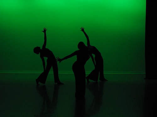
This piece was a repeat from Style/Form, and it was very fast-paced and angry. Allison wanted a leafy, foresty look, so she asked for patterns on the dancers, and in Style/Form, I wasn't able to get it to work very well. However, with a second chance at it, I used more saturate colors and changed the instrument focus a bit, and the leaf patterns showed up quite well this time, I think. An unexpected side effect of the bright green cyc is that whenever the dancers were in silhouette, they left weird blue streaks as they moved. It was clearly a trick of the eyes, but it still looked very cool. Picture 9 IMG_2136.JPG
Decompose. Recompose

Heather Wigmore

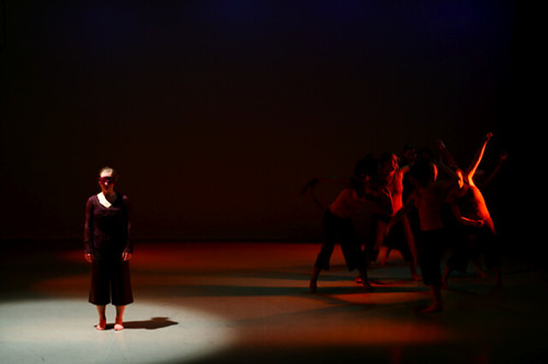
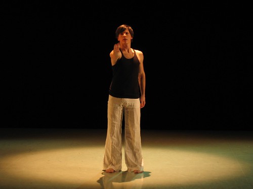
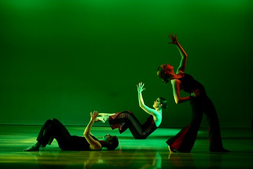
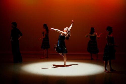
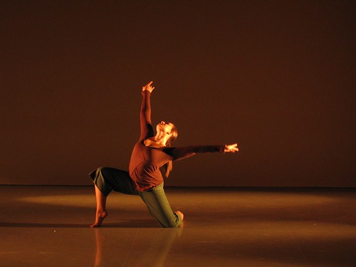
Heather didn't really have any clue what she wanted in the way of lighting, so I took the opportunity to play a bit, and use a lighting technique that I've seen Charlie Chapman use from time to time: having intense complementary colors from opposite angles. Where the lights blend, they create white, and the shadows cast by each light are actually the areas illuminated by the other color, so it actually makes all the shadows colored rather than black, which I think looks neat. I don't think I was completely successful in mimicking Charlie's work in this piece, but I still like the overall effect, especially on her face. Picture 1
Alone Everybody

Laura Vilines

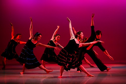
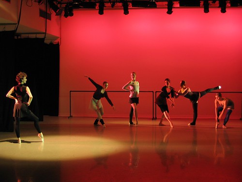
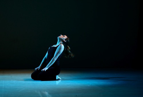
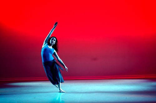
This dance was divided into three sections; I am posting pictures of the first and last section. This dance discussed themes of solitude and becoming part of a group. All of the lighting is very saturate because Laura wanted bright colors (look at the accents on the dresses). The first section is the orange one, and it was a short solo section for Laura; she stood in that pool of light and considered breaking out of it, but never really managed to. That's the solitude part. The second scene was blue, and involved lots of group work. That represented the group--what everybody else was doing. The third section is the red photo, and it involved similar choreography to the second section, except this time it told a story about a girl going from solitude to becoming part of the group. My lighting for this dance very closely mirrored the music; it was bright and fun and happy, and for the last piece ("It's Oh So Quiet" by Björk), I went with the mood changes almost exactly. This seemed to work, because the choreography was very open and forthright. Picture 10 Picture 3
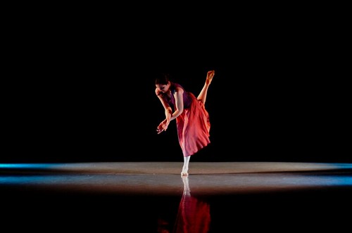
Drifting into Focus

Patricia Engel

The lights for this happened by accident--because of the white floor, any lights that shine on the floor are very visible. When I turned on the side lights with an intense blue color in them, I created those really nice-looking symmetrical scallops on either side of the stage. Because this was a very symmetrical, structured piece with music that sounded a lot like Philip Glass or Brian Eno, I immediately had a "eureka!" moment when I saw those scallops on either side. As you can see, Patricia's costume is pink and purple, so I used the blue scallops to accent her costume, and then I used pink in the mid and high side lights to make the costume and her skin seem warm and mellow. The eureka part was when I realized that her dance enters from the upper-right corner of the stage, moves downstage, and then goes back out that part of the stage. I followed the dance by turning on the alleys of side light one by one, from upstage to downstage, and then turning them off in reverse order, and I think it looked great. This was probably my favorite piece of the show. Picture 4
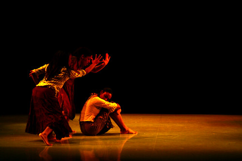
Sorrows of the Past

Marquita Redd

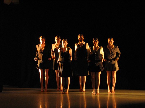
This piece was about black people in the South getting lynched. It was a repeat from Marquita's thesis, but I didn't design lights for that, so I essentially re-created the lights from scratch, based on what she told me her original designer had done. I didn't really enjoy this piece, just because I thought the theme was overdone, but the lighting came out quite nicely; I've noticed that reds and yellows do a good job of accenting dark skin. Picture 2
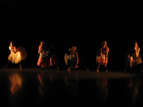
You Must Meet My Wife

Justin Huebener

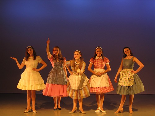
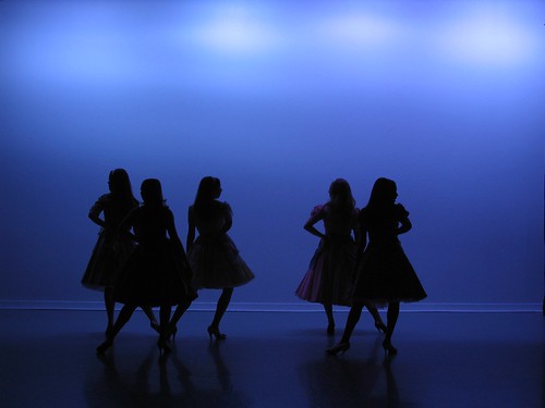
This was another repeat from Style/Form, and I'm really glad I got the chance to re-do it--I just wasn't happy with the lights for it the first time, and I think they were much improved this time around, even though all I really changed was that I used more saturate colors. The picture, however, isn't from YCS, it's from Style/Form, so you don't get to see how much better things looked, sadly. Basically, this piece was about sexual repression in the 1950s, I think. That makes it sound rather pompous and dreary, but it was actually just a heck of a lot of fun; the dancers maintained expressionless faces throughout most of the dance, making robotic sexual gestures and movements, and everyone was cracking up the whole time. It was set to "Hey Big Spender" from Sweet Charity, and the dancers were pretty much acting out a weird robot version of that in big frilly dresses, so you can probably imagine how strange it was. IMG_2171.JPG IMG_2167.JPG IMG_2172.JPG
Nostos

Meredith Wilensky

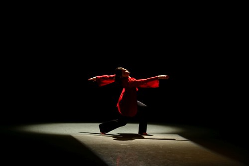
This dance also included a eureka moment; when Meredith started asking for lights that kept her in a pathway up and down center stage, I realized that a rectangular path from the back would look great, so I added that as a special. Then I saw her costume, and things got even better, because as you can see, the fabric of her shirt was a translucent red material that glowed just beautifully under the backlighting that I had. Picture 8
Unbounded

Jenny Boissiere

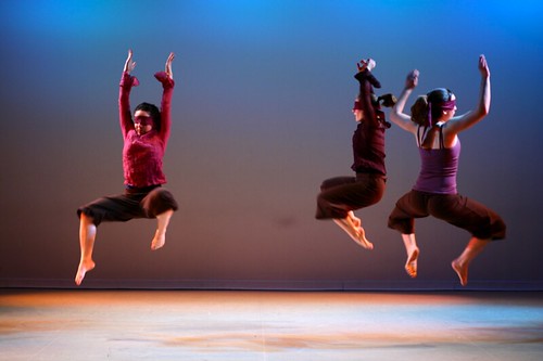
No, you're not imagining things; the dancers really are wearing blindfolds. Luckily, the blindfolds were thin enough that they could see through them reasonably well--so long as the lighting was bright enough. My first priority with this dance was clearly to prevent collisions, so I just picked colors that I thought went well with their costumes, and then turned everything up full blast. Not particularly creative, but it still came out nicely. The music for this was really cool a cappella beat-boxing. Throughout the dance, one by one, most of the members of the company took off their blindfolds. I thought it would be really cool to make them go dark as they took their blindfolds off, to kind of invert the audiences expectations of what happens when you remove an impediment to clear sight. However, that ended up being not really possible given the choreography, and it would have been semi-dangerous for the dancers who were still blindfolded, so I settled for just changing the color on anyone who wasn't blindfolded. By the end, only one dancer was left with a blindfold, and you can see in the second photo that I got my chance to make the blindfolded person light, and the un-blinded dark, which I was happy about. Picture 7 Picture 5
Happening

Rebecca Hutt

This was a cute little piece that I really enjoyed. It had already been performed at the American College Dance Festival, so someone designed lights for it there, and I mimicked what they did based on description. I admit that I probably wouldn't have come up with this particular color scheme on my own, but I really liked it, and I'm going to add this type of look to my bag of tricks. I only wish the floor weren't so reflective, because the red on the back wall kind of turns into purple near the bottom, as it blends with the blue from the stage wash. Picture 6 And, that's all the dances in YCS 2006--I hope you've enjoyed reading about them! Just for fun, here are some shots that I took myself from Style/Form. My camera isn't great though, so these aren't of the highest quality. IMG_2132.JPG IMG_2147.JPG IMG_2155.JPG IMG_2163.JPG IMG_2161.JPG
Thursday, April 20, 2006

Some Light Designing Lessons

I've done a lot more light designing over the past few months, and I've learned some useful rules of thumb:
  1. Make sure your top lights are soft-edged, otherwise people will look like they're getting darker when they walk in and out of them.
  2. When designing a dance concert, use VERY saturate colors. If you ever say to yourself "that's too saturate," then you're probably wrong, and it's just right.
  3. Also when designing a dance concert, pick a palette of side light colors before you start tech with the choreographers, and stick to it. That way, if the designer wants green, or blue, you'll already have the gels sitting nearby, and you know they'll look good with the colors you have for your top and back lights. It's usually good to have a darker and a lighter shade of everything too.
  4. Always make sure to hang, or have enough circuits available for hanging, a smack-in-the-face front wash. It'll flatten everything out when you use it, but directors and choreographers will inevitably tell you "I need to see their eyes". If you can bring the front wash in at a low level, it'll fill in the shadows under the brows, without compromising the modeling from your main lighting. This will make the director/choreographer happy, and keep you from looking stupid.
  5. During the rehearsal process, arrange with somebody (probably the stage manager or assistant stage manager, or your assistant light designer, if you have one) to make a note of every time somebody stands on something. Unless the actor is really short, the extra foot or two of height will make most actors' heads disappear above your light if you don't compensate for that action.
  6. Likewise, especially with plays and sets that have highly localized scenes where the action tends to be limited to certain subsections of the set, arrange to have yourself notified whenever the director blocks a scene that breaks those boundaries. This will always happen; 75% of the play will occur within your nicely-defined lighting boundaries, but at some point during wet tech, usually in Act 2 when everyone is tired and wants to go home, the blocking will call for an actor to cross between two areas, and it will look like they walked into a black hole for a second. If you're aware of the areas whose boundaries are broken often, you can smooth out their blending so that those dark spots don't have to be fixed later.
  7. Make sure you know what your director wants. At least at my school, lighting designers are not necessarily encouraged to work as closely with the director as the scenic or costume or props designers, and I think that's a mistake. Even though most directors feel less comfortable with lights, you as the designer at least need to make darn sure that you're on the same page as the director as far as your concept of the play, and it wouldn't hurt for you to go to plenty of rehearsals too. That way, you'll design something that the director feels comfortable working with, rather than lights which the director feels hamper his or her vision.
  8. Contrast can create the perception of darkness. If you have a VERY bright key light from a shadowy direction (side, top, back), it will tend to override some of your fill lighting and make the scene look like there is darkness where there isn't, because the eyes adjust to the brightest part of the scene. The solution here is not more light, because you will end up with everything at 100%, and it'll still look shadowy. The solution is to take the key light down a bit, and as it gets closer to the level of the fill light, suddenly those shadows will get filled in, and the scene won't look so stark.
I'm putting these down partially for my own benefit, so that I can remember them until they become internalized, but I figured that it's a good idea to have them out on the Internet in general as well, so that other new lighting designers can benefit.

Thursday, December 15, 2005

WashU Dance Theatre + Update

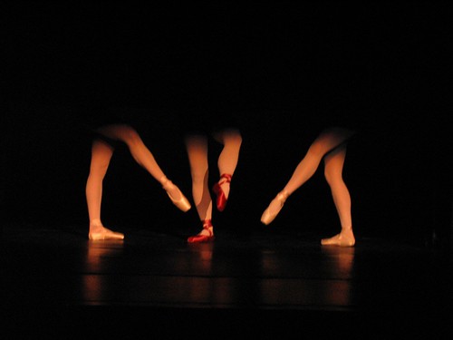
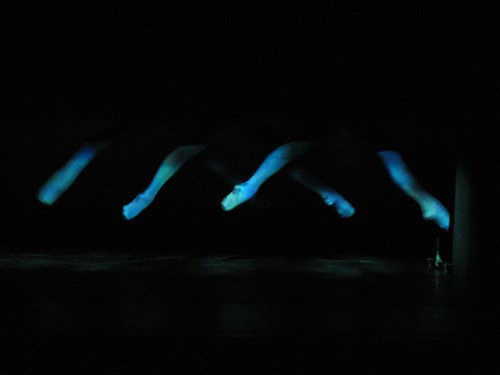
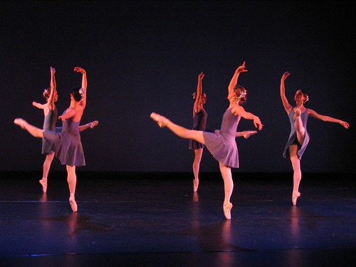
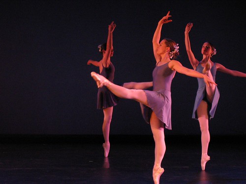
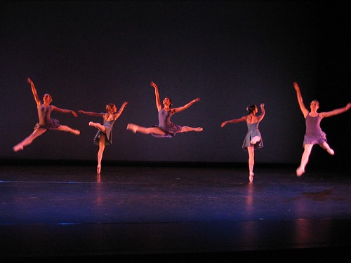
Wow, nearly two months since my last post. Sorry about that, folks. What have I been up to in the interim? I did lights for WashU Dance Theatre, which was a lot of fun. I'll post some pictures of that below. Currently, I'm working on sound design for Ipi Zombi?, and I will soon be starting light design for Justin Huebener's senior dance thesis. Anyway, I want to keep this short, so on to Dance Theatre pictures. As some background, there were six choreographers in the entire show. Each choreographer was assigned a lighting designer. I designed lights for Christine O'Neal, who did a pointe ballet piece. Christine's piece, in turn, was divided into three sections with interludes in between. The piece started out with the theme to Rocky, and one of her dancers ran down the house left aisle and onto the apron (a part of the stage which is in front of the proscenium). There was a spotlight waiting for her there, and she sat in the pool of light and began to put on her pointe shoes. I don't have any pictures of that; kind of an oversight on my part, although the lighting itself wasn't particularly interesting. Then the curtain went up, and all the audience saw was a small box containing the legs of two pointe dancers, dancing to Swan Lake. In the middle of the dance, a pair of legs wearing bright red shoes dropped in between the other two and screwed up their rhythm. Think the crazy flamingo in Fantasia 2000. Here's a picture of the two pink shoes kind of attacking the red shoes: Pointe Shoes For lights in "Swan Lake", I just used a light pink color, to bring out the pink and red tones in the shoes. I used no side lighting because I didn't want to light up anything but the legs, and side lights would have allowed the audience to see bits of the stage and things behind the dancers. I used two Source 4's from the balcony rail, and shuttered them so that they both made squares of light on the box. Once the pointe shoes finished, the light went back to the dancer sitting on the apron while the dancers changed costumes for the next dance. The curtain went back up to reveal the same box, but this time the music was reminiscent of orca whales, and the dancers clad in mottled blue-green tights. The went floating across the box, using two parallel bars out of side of the audience. Here's a picture of what we called "Whales": IMG_1968.JPG For lights in this I also used Source 4's from the balcony rail, but this time I used two different colors: a blue-green and a green-blue. They were close in color, but I like to think that they helped accentuate the costumes, although it's hard to tell. I also used gobo scrollers in each light, set at a very low level, so that there was actually a mottled pattern to the light which slowly changed and shifted throughout the piece. I doubt anyone noticed it, but when I didn't have the gobo scrollers working, there was definitely a static quality to the light which I didn't like. Lastly, the light when back to the dancer on the apron, but this time her light stayed up as the curtain went up on a full stage. The dancers were clad in rehearsal clothing, and the music was a tentative piano piece. Every so often, snippets of a symphonic string piece could be heard fading through the piano music. Each time this happened, I brought the lights up a bit, so the brightness was gradually increasing throughout. At the end, the dancers took off their rehearsal costumes to reveal full performance dresses. Then the piano disappeared, the symphony music began, and it was time for the "real" performance. For this, I brought most all of the lights up to full blast. I don't have pictures of the interim parts, but I do have shots of the full performance lighting. Here are a few: Ballet 1 IMG_1959.JPG This photo, incidentally, is a good look at how light can give shape and definition to a person. Take a look at the front most dancer. First, look at the leg she is standing on. Notice that the right (stage left) side of her leg has a bit of extra brightness to it, but overall, the leg is essentially illuminated the same amount over its entire visible area, left-to-right. Now, look at her upraised arm. See how both sides are significantly brighter than the center, and there is a long, smooth gradient between light and dark areas. This gives the arm shape and definition--you know it's an arm, instead of just a flat piece of cardboard shaped like an arm, because those shadows exist because of the three-dimensional shape of the arm. Ideally, in a dance, you want everything to be shaded like her arm, not like her legs. However, many choreographers want lots of "face light"--frontal illumination, so you can see the dancers' faces. Sadly, frontal illumination "flattens" dancers by making them look like cutouts. It's kind of a compromise between light designer and choreographer as to how much face light there is, sometimes. In this case, the dancer's upraised arm is above the level of the front lights, while her leg is right in it, so the leg is flat while the arm is shaped. I actually think the front light worked well in this case--this dance was very much about the stereotypes and clichés of pointe ballet, so making the dancers look somewhat flat and two-dimensional actually gave the piece a nice effect. IMG_1961.JPG I love this photo. Anyway, for this dance I used plenty of front light, at Christine's request. I also used blue "cyc" (short for cyclorama) lights on the back to set off the shape of the dancers. Then I used warm side lights to give them that definition I talked about earlier. Finally, since the front light tended to wash out the blue on the cyc, I added some pretty bright blue back lights, which gave all the dancers a subtle blue halo. You can see it in some of the pictures if you look closely (you'll probably have to look at the large versions). I also used blue and yellow high side lights, which added to the kind of definition the sidelights gave. And that's that. I'll post stuff on Ipi Zombi when I get the chance.